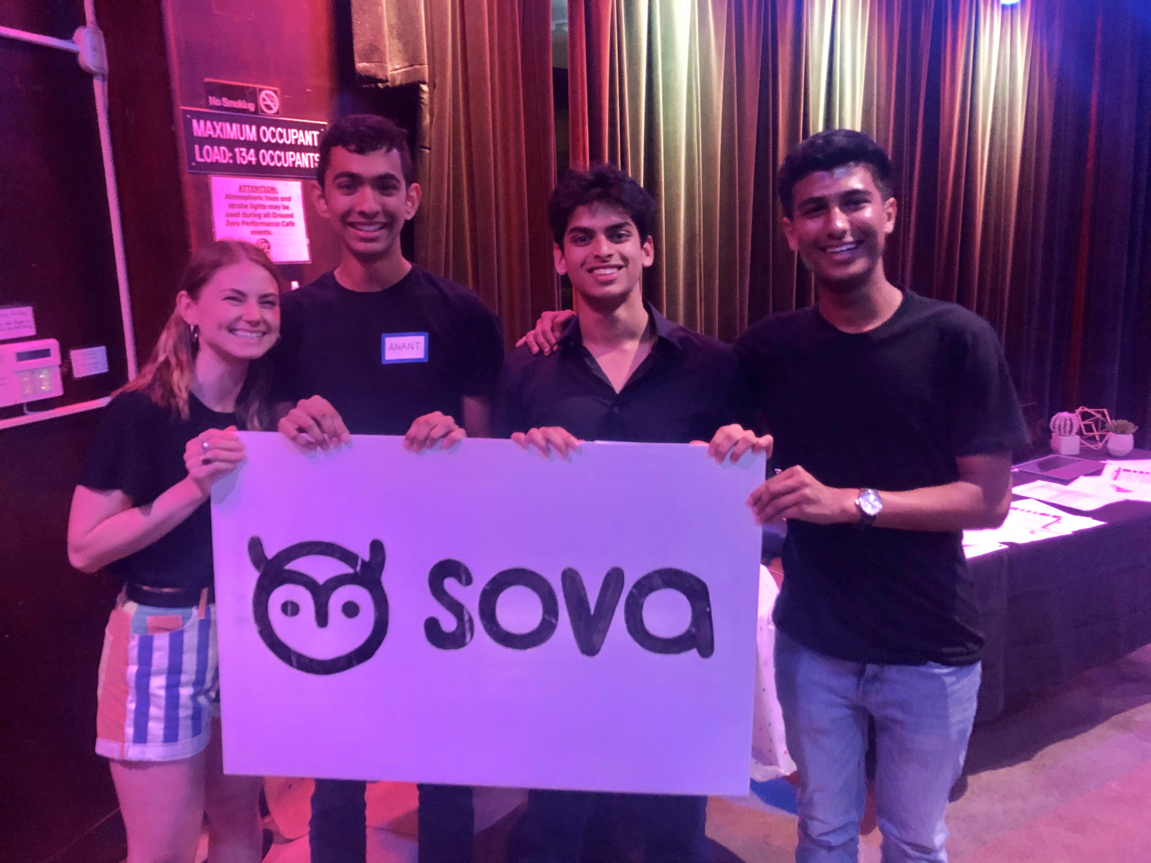
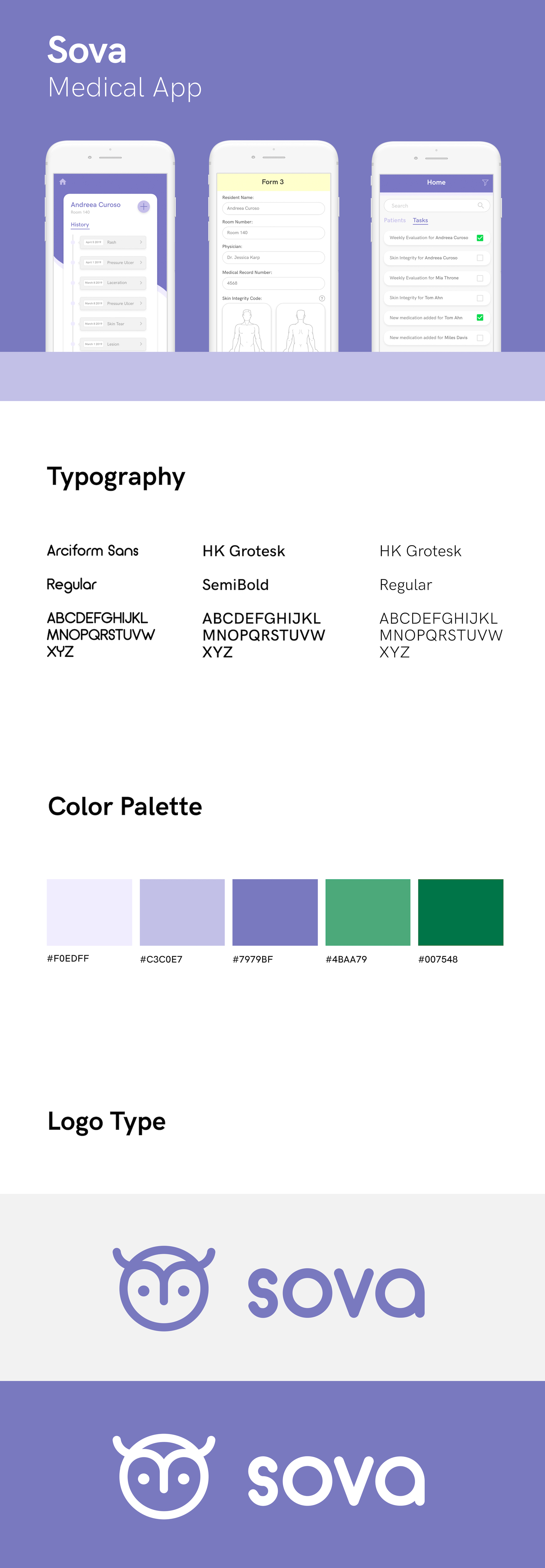
DESCRIPTION
Sova streamlines paperwork for small elderly care facilities so nurses can save time and focus on providing care.
ROLE
ROLE:
Lead Product Designer
Co-Founder
Lead Product Designer
Co-Founder
SKILLS
SKILLS:
UX/UI Design
User Research
Rapid Prototyping
Graphic Design
UX/UI Design
User Research
Rapid Prototyping
Graphic Design
UX/UI Design
User Research
Rapid Prototyping
Graphic Design
TIMELINE
Jan 2019 - Jan 2020 (1 year)
June - August 2019 (10 weeks)
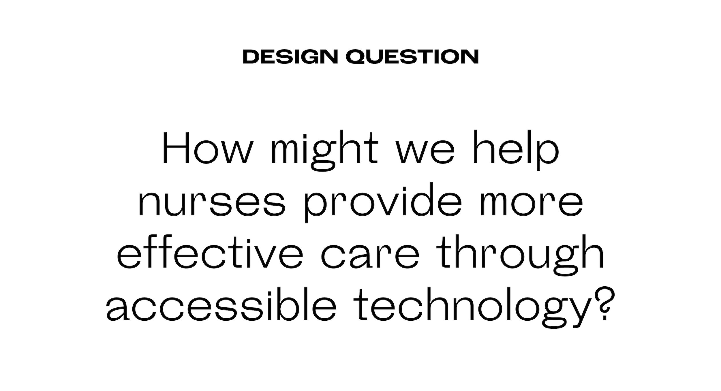
PROBLEM
The geriatric care space is not growing fast enough to meet demand, and nurses in small scale facilities are especially overburdened. The number of adults over 65 needing some form of long-term care in their life is expected to surpass 78 million in the US alone. Yet current infrastructure is not growing fast enough to support demand, and the facilities catering to this population are understaffed and overworked.
As part of USC’s Student Start-Up Incubator, Lavalab, my team and I decided to explore the problems of geriatric care after we realized how no one is designing local and sustainable solutions for long-term care.
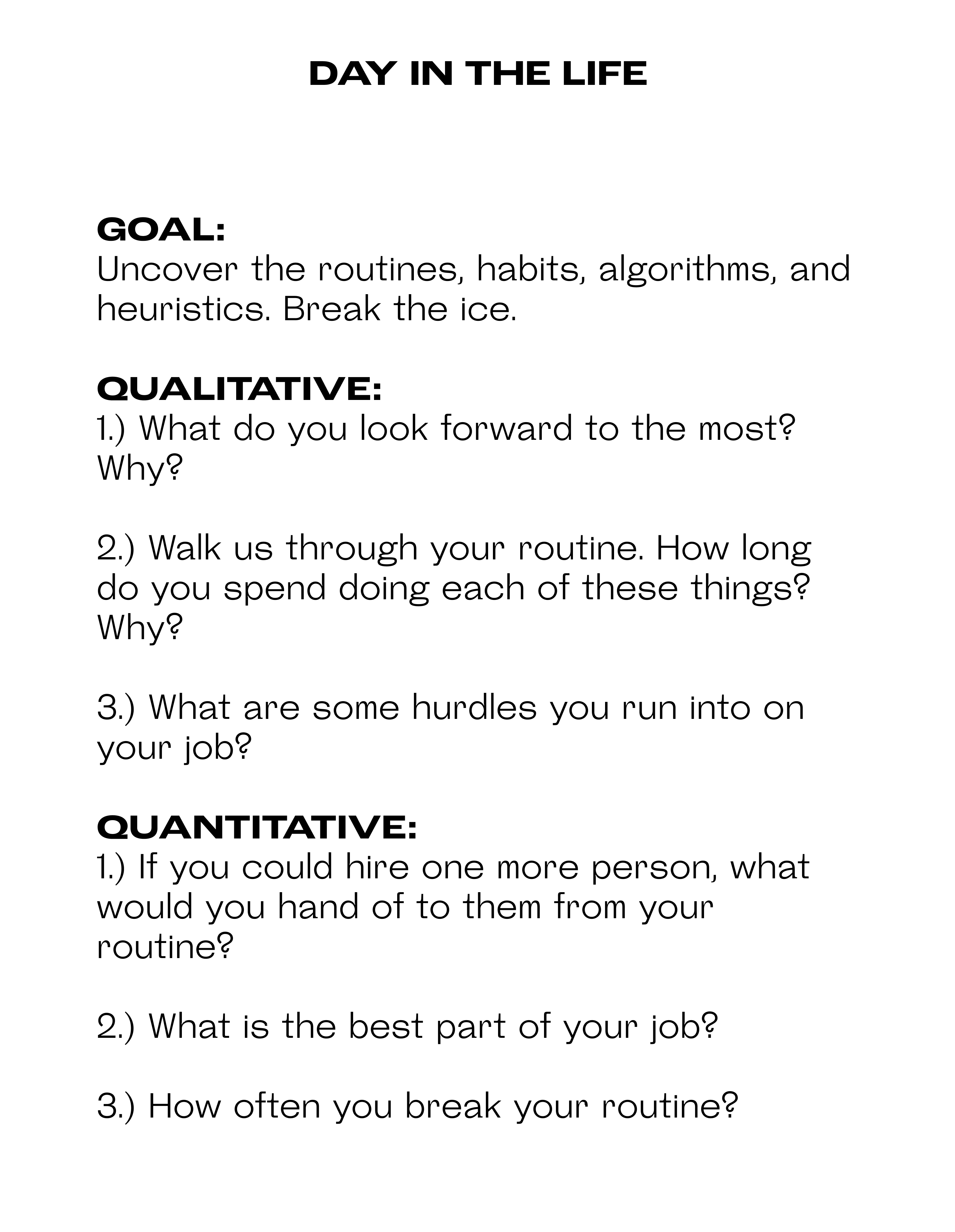
UNDERSTAND | USER RESEARCH
My team and I started exploring this problem by going to our closest long-term care facility, Vernon Health Center, and talking to as many people as possible including treatment nurses, administrative staff and patients. As we immersed ourselves into this space, we realized generally lower digital literacy rates, cognitive and physical impairments, and heavily routinized schedules led to a higher adoption barrier for current consumer-facing products. The insights we gathered made us realize the infrastructure to support older adults already exists, but that operational inefficiencies limit their potential impact.
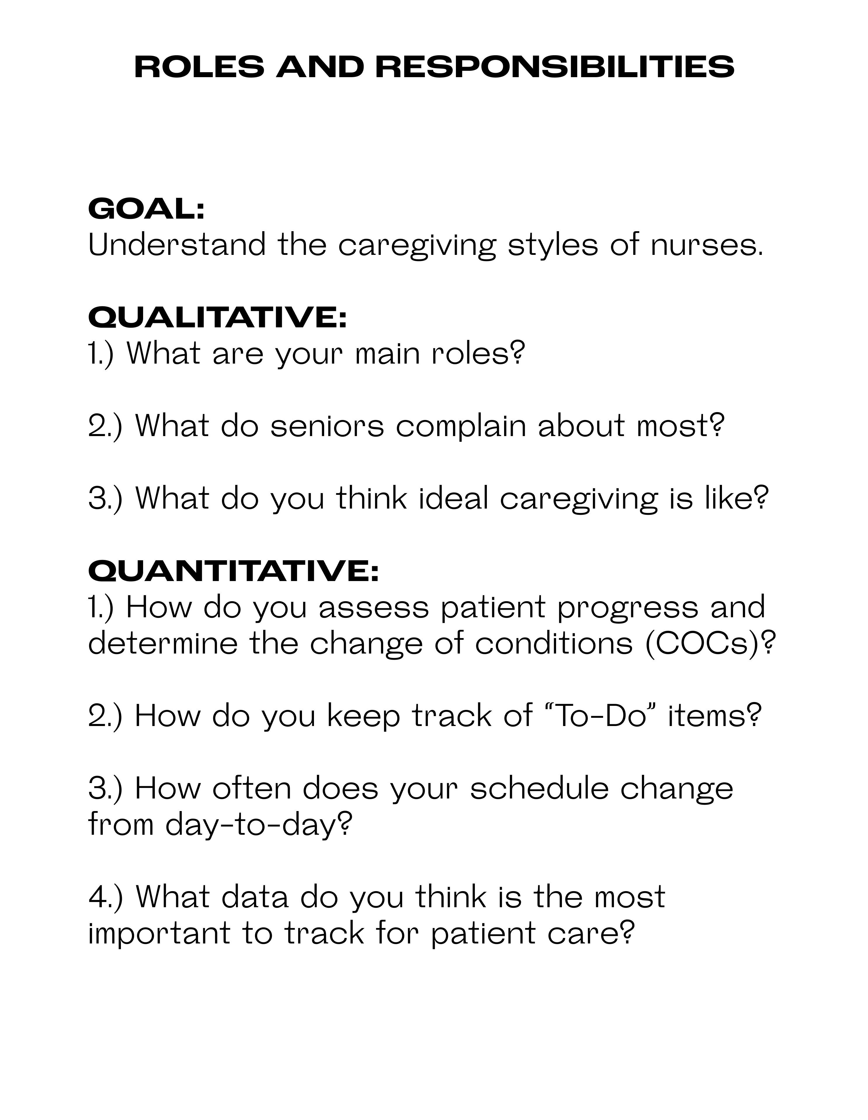
By learning how small-scale elderly health facilities function, we quickly began to understand that the problems arise in the first step of the process: the visit with the treatment nurses. When a patient comes in, treatment nurses are the first ones that look them over and check for any bruises, scars or wounds. With each wound they find, they have to fill out 7 forms so if someone comes in with 7 wounds, that means 49 pieces of paperwork. In fact, they spend a minimum of 1.5 hours a day just filling out paperwork. The paperwork burden placed on treatment nurses shifts the focus away from patients and buried patient information leads to neglect in care.
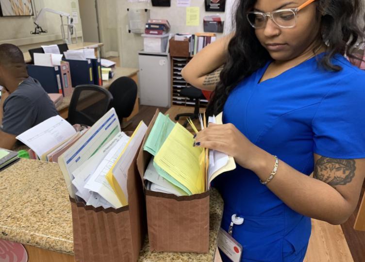
These are just two of the hundreds of file folders nurses at Vernon Health Center use to organize patient information.
The forms nurses hard to fill out were reported to us as “unintuitive” and “distracting”, so when designing our solution, we wanted to focus specifically on the workflow of the nurses as they were filling out these forms. We spent a lot of time figuring out the best possible way to sort patient information, expedite the process of form intake and ultimately, utilize predictive care.
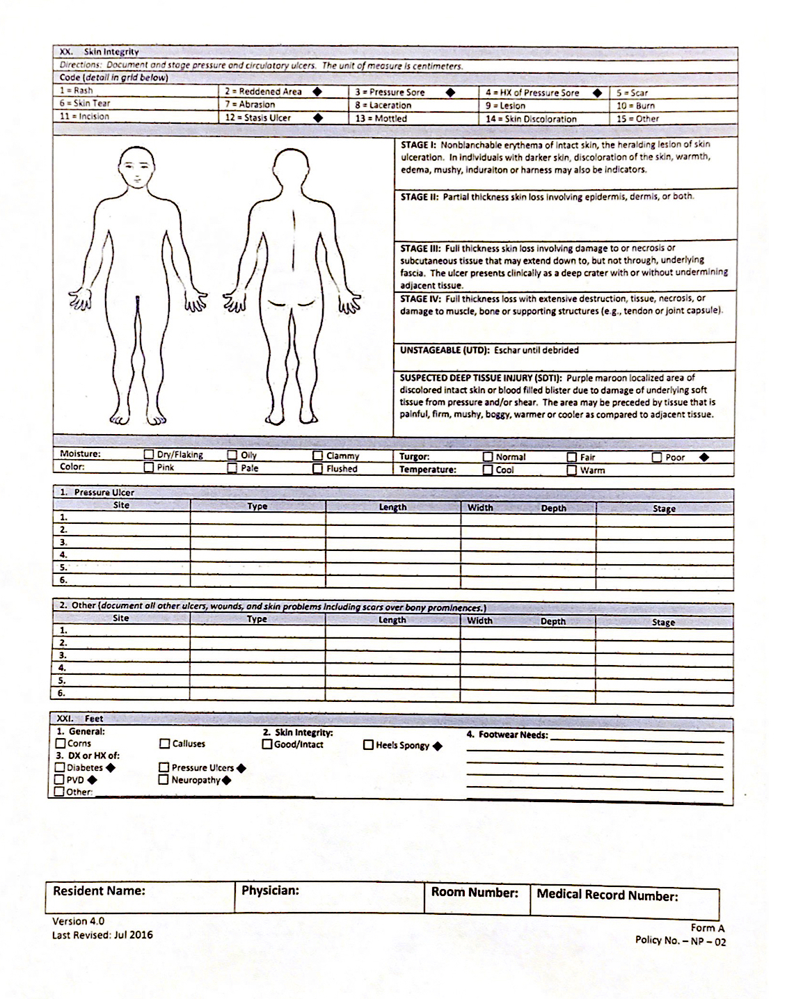
This is one of the seven forms that treatment nurses have to fill out at Vernon Health Center.
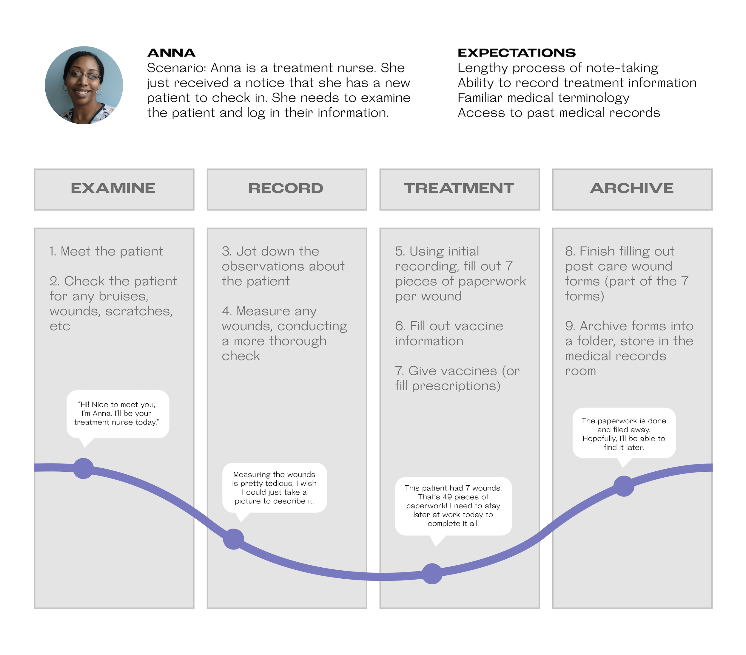
UNDERSTAND | JOURNEY MAP
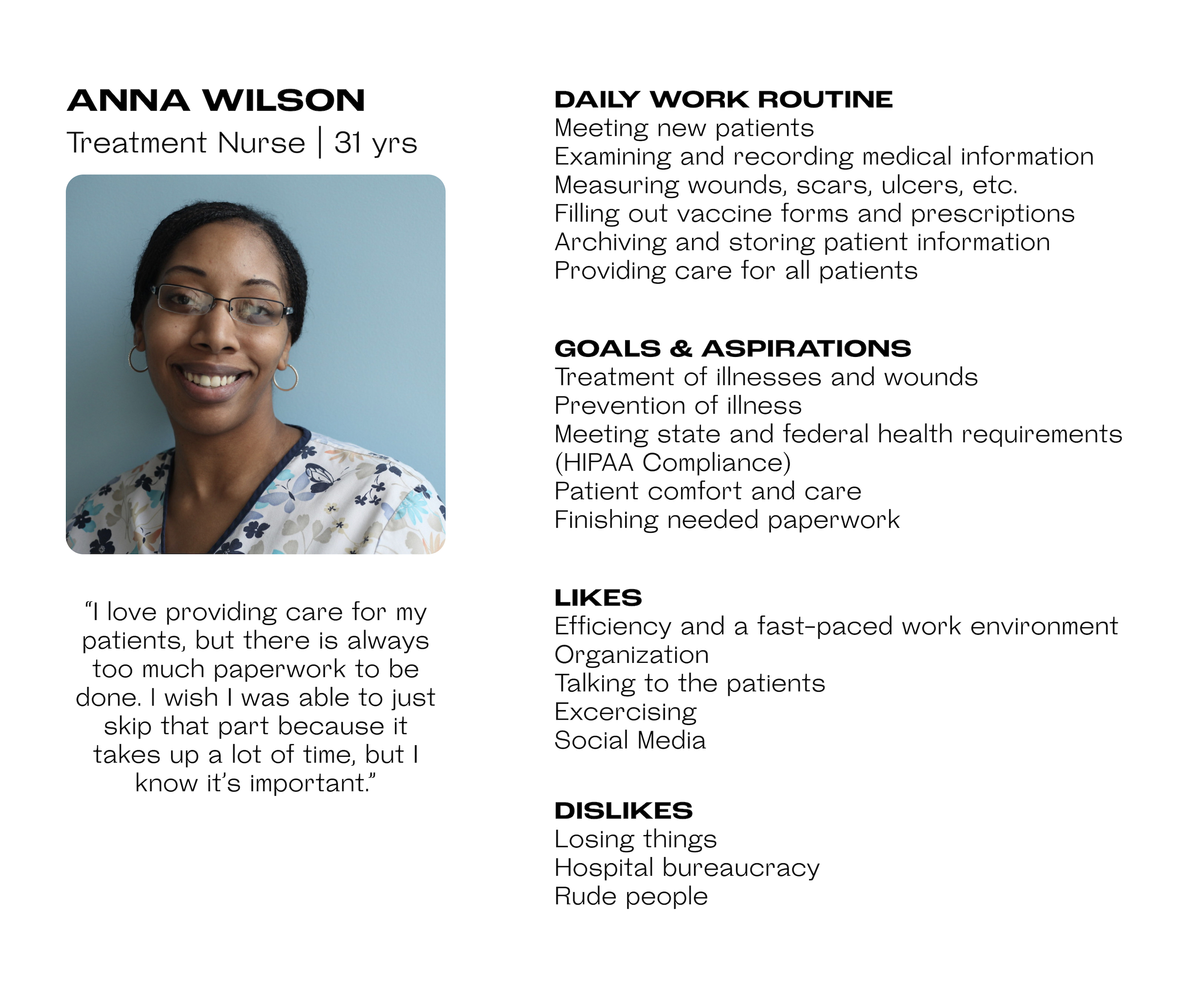
UNDERSTAND | USER PERSONA
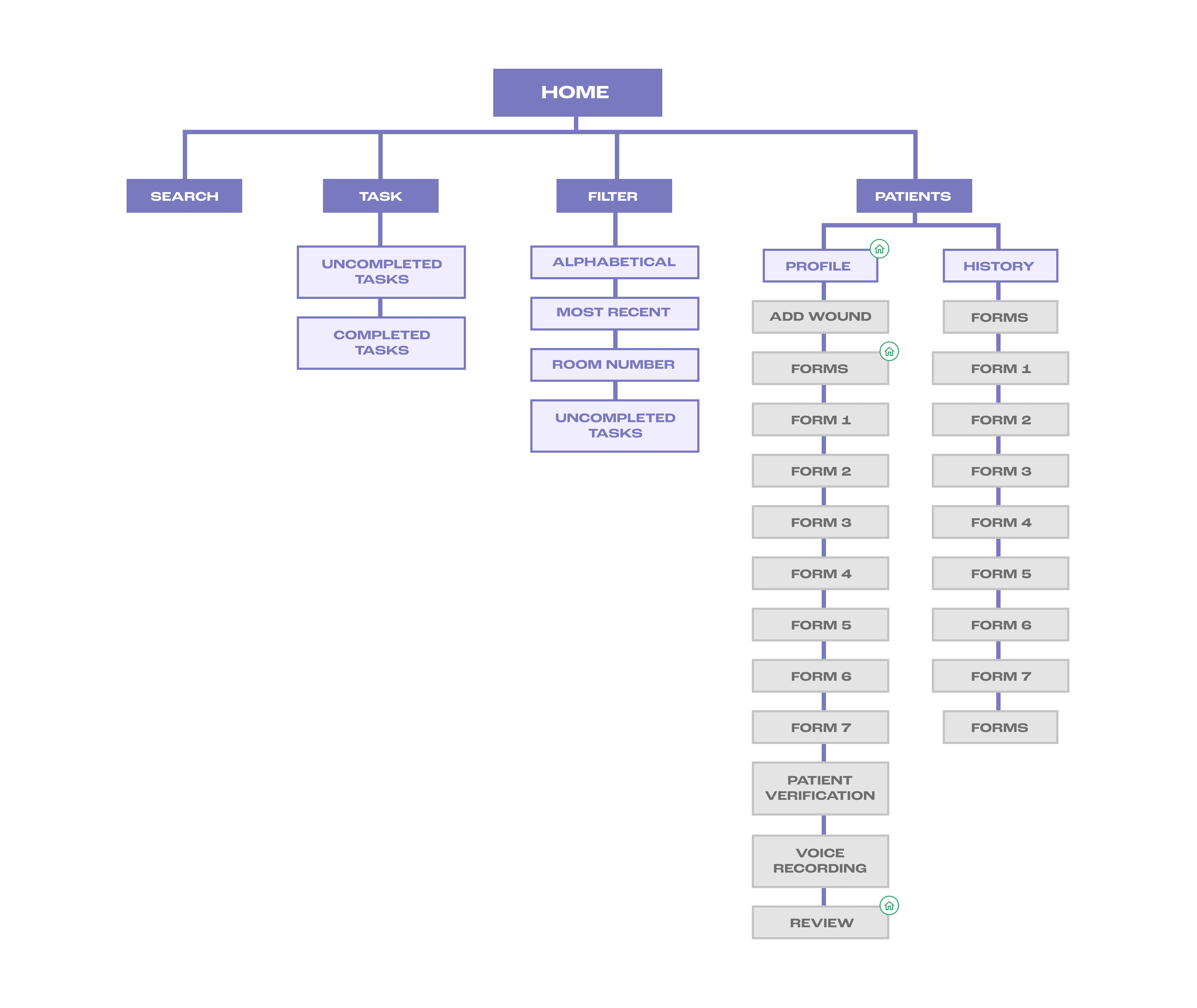
IDEATE | USER FLOW
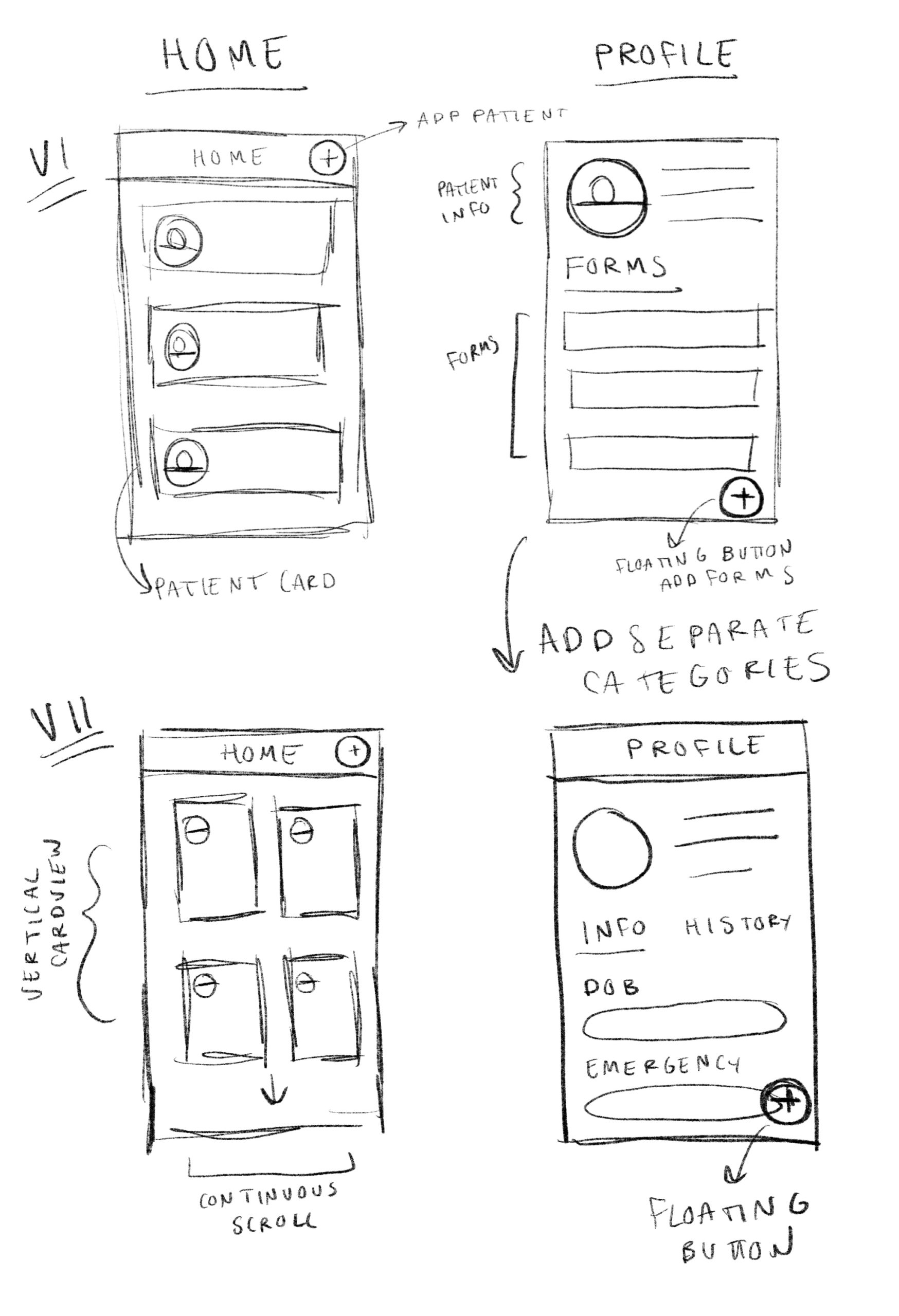
IDEATE | SKETCHES
BUILD + TEST | PRIVACY AND HOME
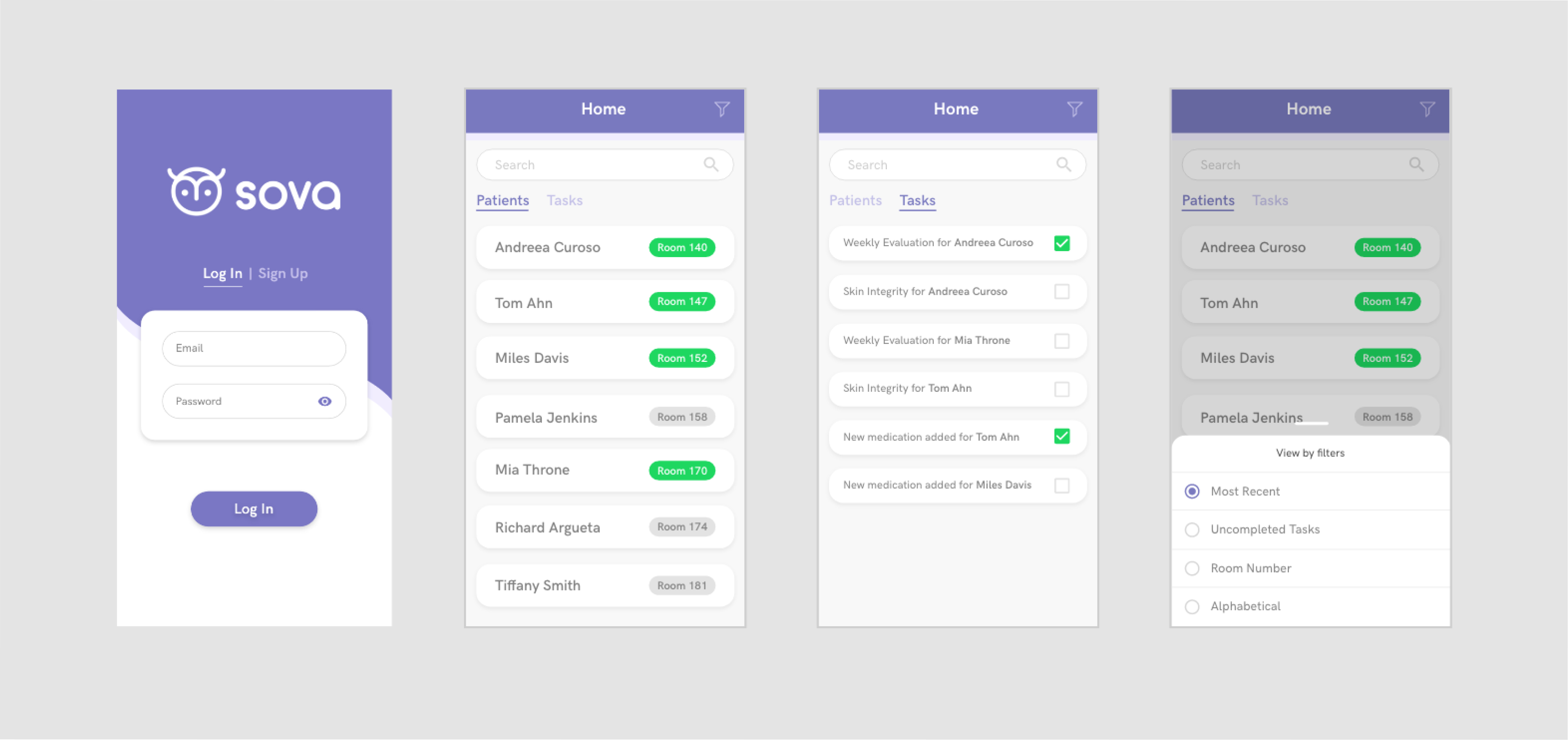
One of the biggest concerns that we heard from treatment nurses when we asked about their day-to-day workflow, was that it was difficult to keep track of every patient coming into the hospital and what tasks need to be completed. So for the very first screen that nurses see when they use Sova, I decided to make it the list of their patients and a dashboard of their tasks, which can all be filtered.
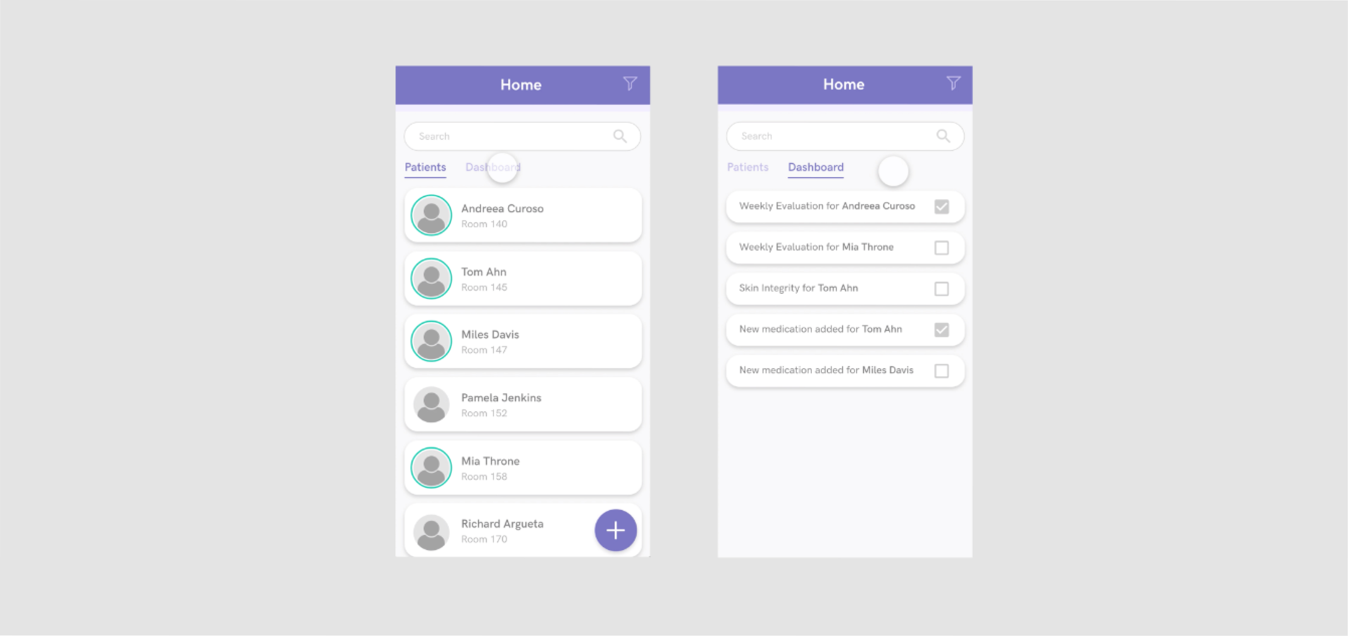
After getting feedback on this initial design, I realized that there was no need to have patient avatars/photos because this information isn’t relevant to the nurses due to the fact that the particular geriatric clinic we worked with was focused on short-term care. I also decided to take out the light green circle around the avatar because, during the user tests, the circles weren’t significant enough to be noticed. Since this was supposed to signify that the patient needs a check-up, I decided to replace it with a larger light green button on the room, which turns green if an update is needed and gray if it isn’t. The same change was translated to the dashboard tab (now renamed tasks) so it’s more clear to see which tasks still need to be completed.
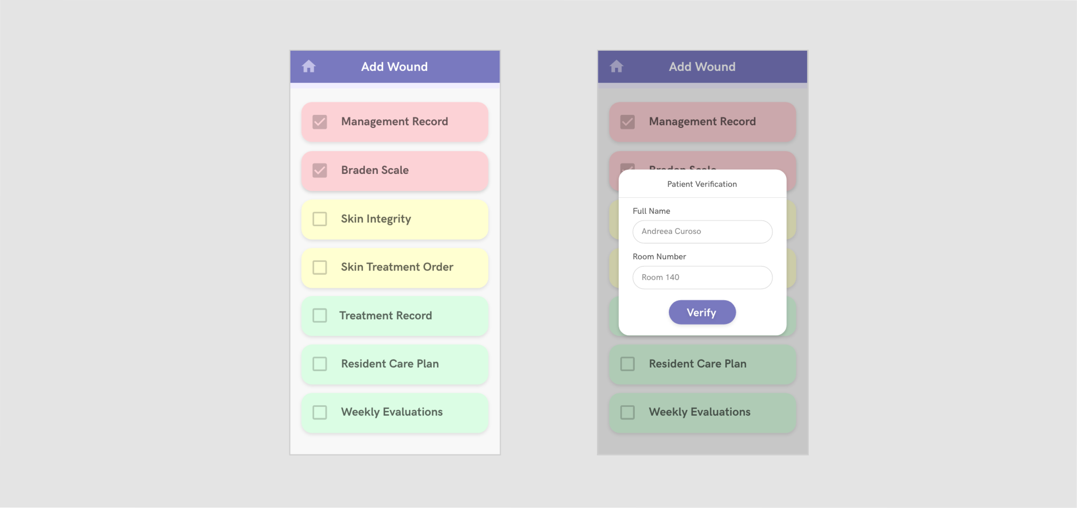
One of the biggest concerns that we received was whether or not this app is HIPAA compliant. Given that we decided to focus on healthcare, our app needed to follow the privacy guidelines established by HIPAA. Some of these guidelines state that patient information cannot be easily accessible and must be encrypted by a password or some form of security. We decided to add the log-in screen which only individual treatment nurses have access to in order to become compliant with these guidelines.
BUILD + TEST | PROFILE
Keeping track of hundreds of forms for every patient becomes a very difficult and tedious task that needs a precise level of organization. So for the profile page, I decided to focus on hierarchy and distilling information.
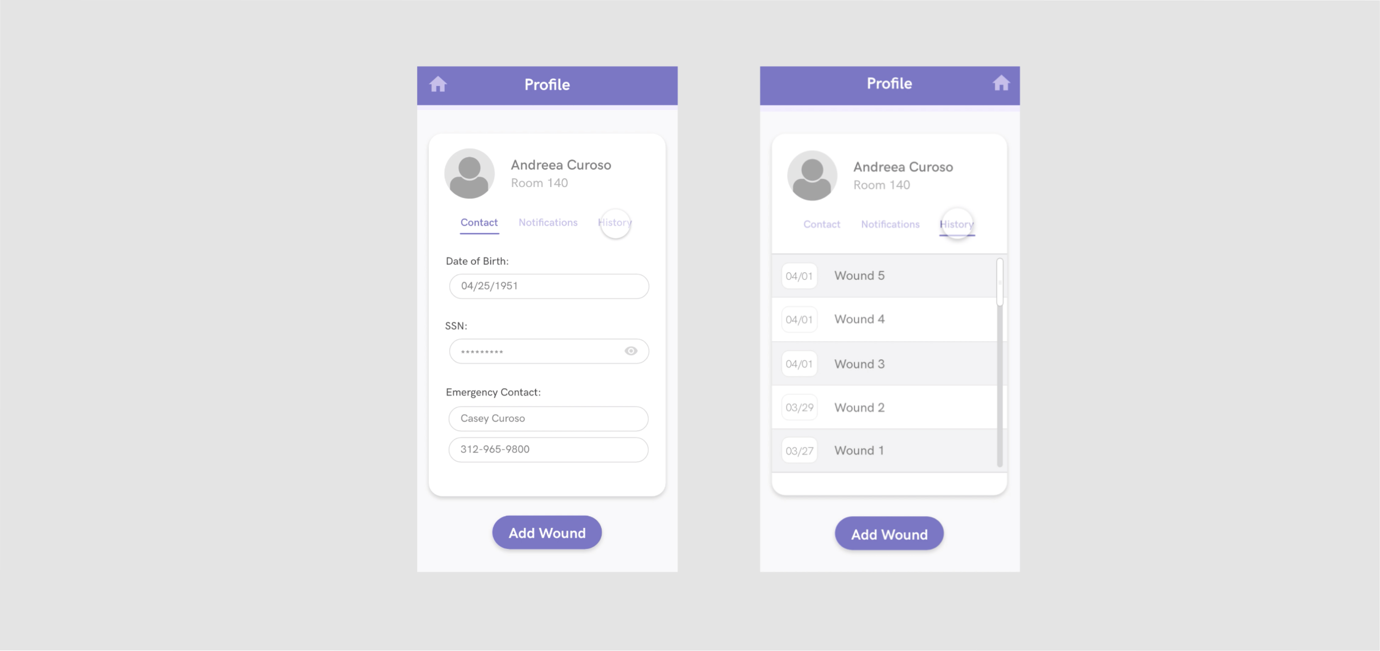
For the first iteration of the profile, I included the patient’s contact information, notifications about the patient and the history of wounds. Similar to the home page, the feedback I received was that there was no need to have patient contact details, given that it’s not always available, it’s not relevant to the nurses and the administrative staff handles that level of information. There was also no need for individual patient notifications since they already appear on the home page.
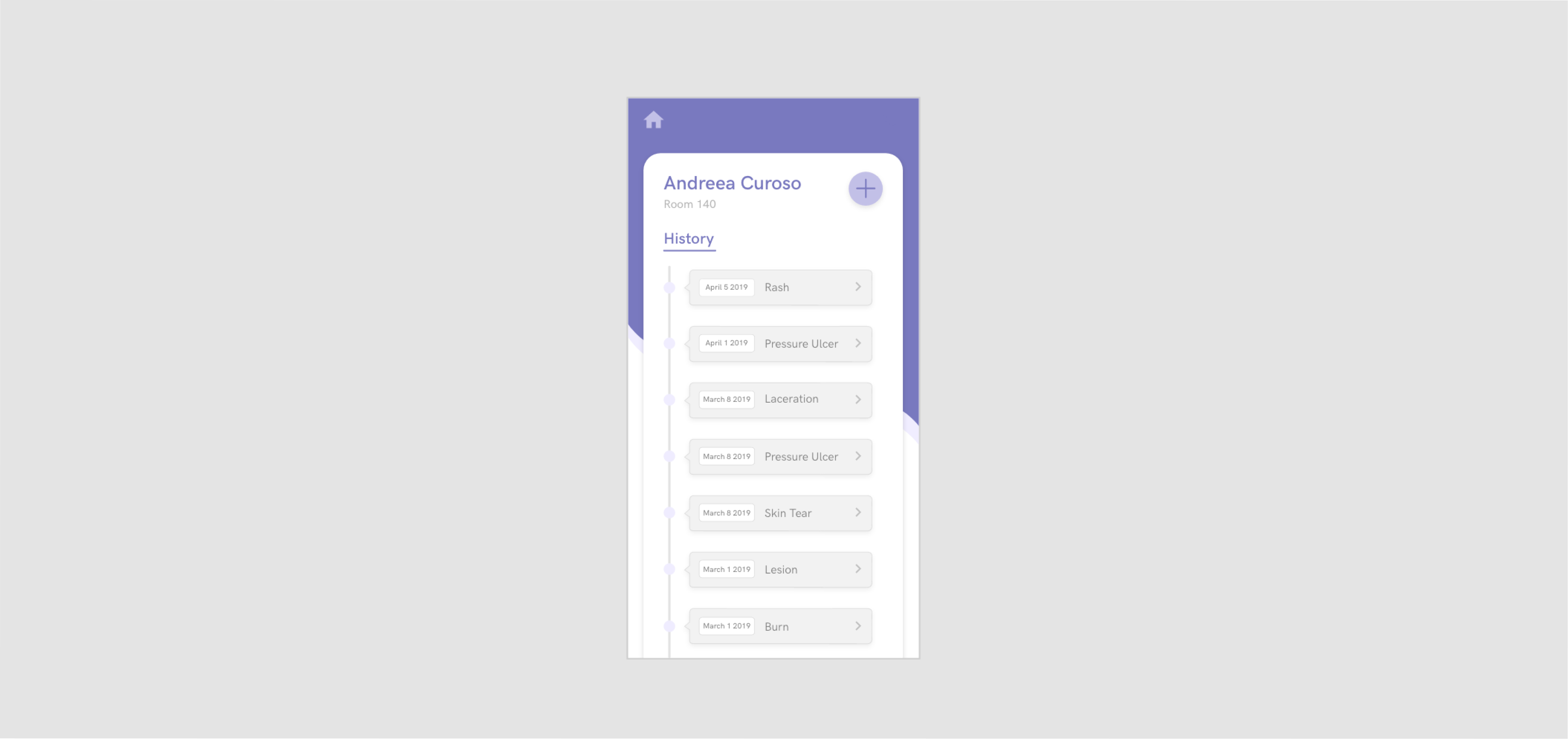
Ultimately, the most important information for the nurses pertaining to a patient is their history of wounds. So for the final design, I decided to only include the wound hierarchy, sorted by date. In this version, the wounds are clearly labeled so it’s easier to see if there are any previous diseases or patterns (which is extremely useful in identifying cases of abuse).
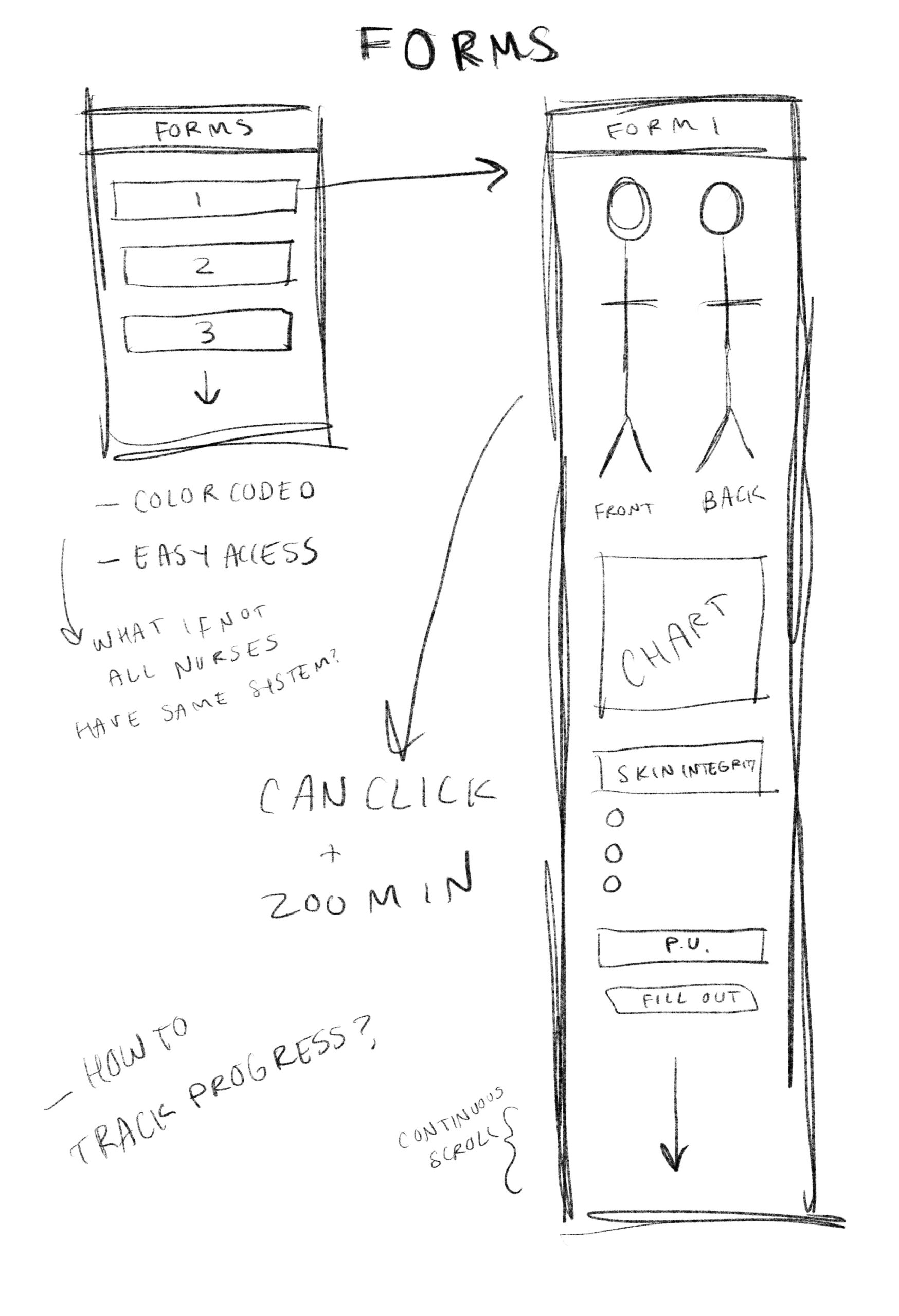
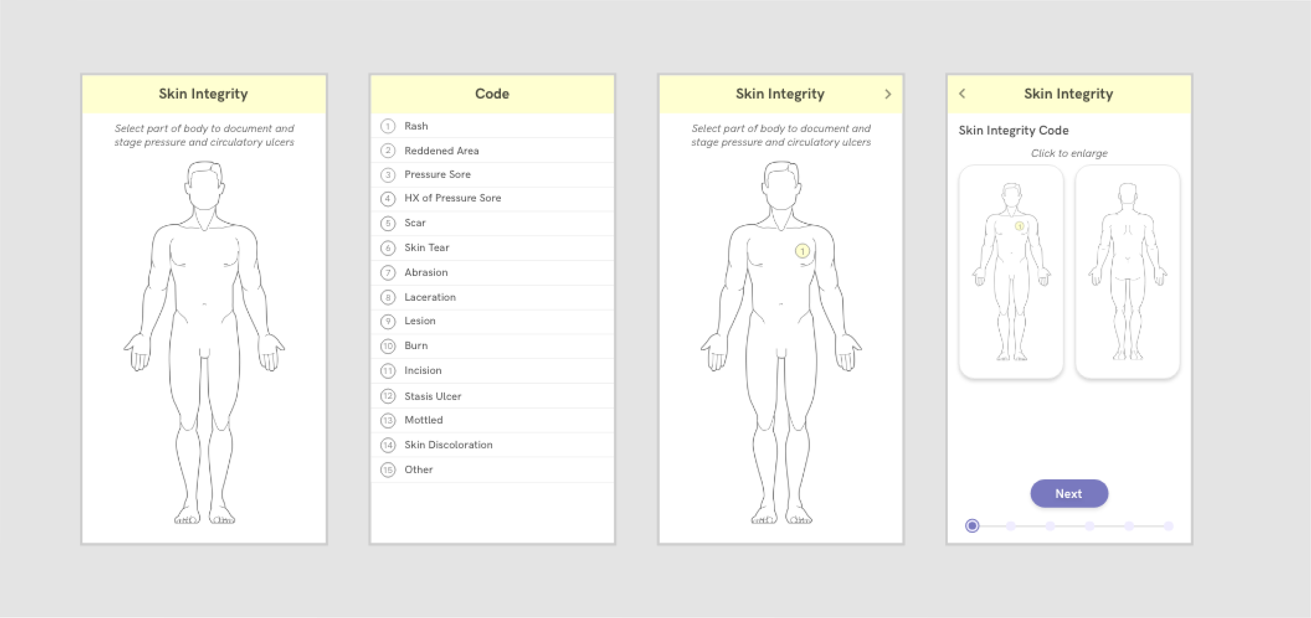
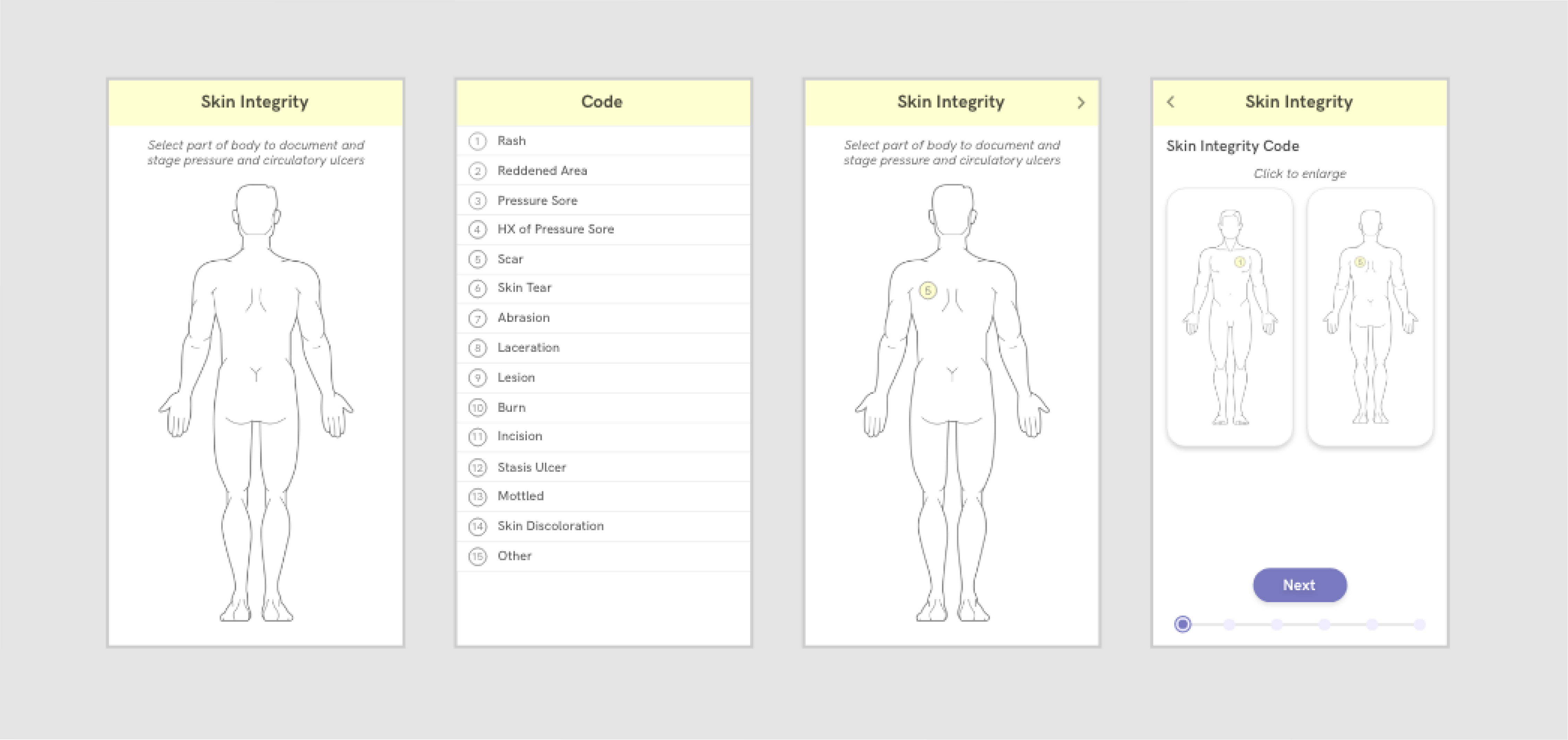
BUILD + TEST | FORMS
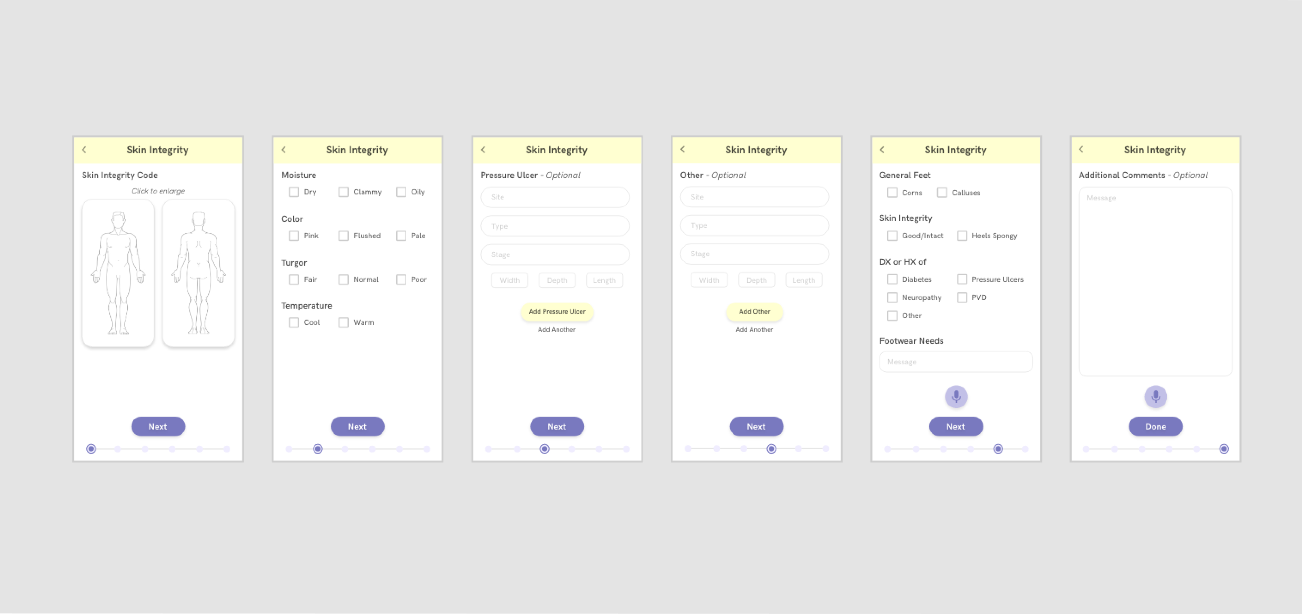
Our most impactful value proposition was that the app could automate forms for treatment nurses so they can save time on filling out paperwork and spend more time providing care for their patients. Card sorting methods informed how our app prioritizes and categorizes information, and the UI reflects this hierarchy based on what we initially discovered in our user research. Our prototype for the forms page also incorporates in-place language frameworks and color tagging systems, which the nurses use and are already familiar with. This minimizes switching costs between using our platform and using the traditional pen and paper to fill out forms.
The technology was further leveraged to expedite the form-filling process. For example, Sova can auto-input information that removes the need for nurses to copy the same information on multiple forms. Furthermore, voice transcription APIs (signified by the microphone button) minimize time spent scrawling illegible notes that can lead to negligence in long term care.
BRANDING
With Sova, I wore a lot of hats - while researching, I conducted thorough user tests and identified our values (being optimization, organization, cognizance, and compassion), which helped to inform our branding and logo.
NEXT STEPS
Creating Sova has been a great learning experience that taught me how to work effectively and efficiently with developers and a product manager, how to design an app based on an overarching question, and how to pitch the concept to a diverse audience.
Currently, we are working on potentially pivoting our product or restarting and focusing on a new industry. We see Sova as a stepping stone into creating something much more impactful and as an opportunity to ask ourselves “What problems is our team best suited to solve?”.
For more information, please check out our final Demo Night Pitch Deck, which we presented to our peers and investors.