
DESCRIPTION
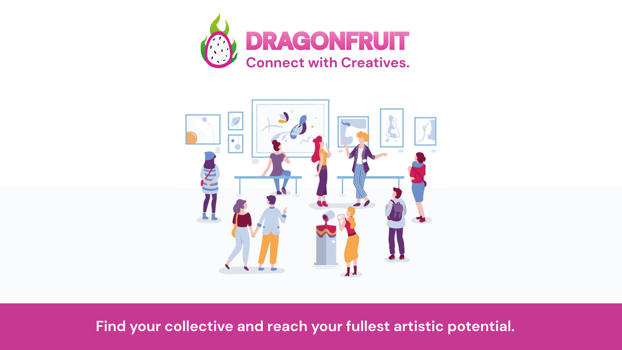
Dragonfruit allows you to find your collective and unlock your full artistic potential. Using Dragonfruit, creatives can connect, share their work, and find jobs and local events.
ROLE
ROLE:
Product Designer
Co-Founder
Lead Product Designer
Co-Founder
SKILLS
SKILLS:
UX/UI Design
User Research
Rapid Prototyping
Graphic Design
UX/UI Design
User Research
Rapid Prototyping
Graphic Design
UX/UI Design
User Research
Rapid Prototyping
Graphic Design
TIMELINE
September 2019 - December 2019 (3 months)
June - August 2019 (10 weeks)
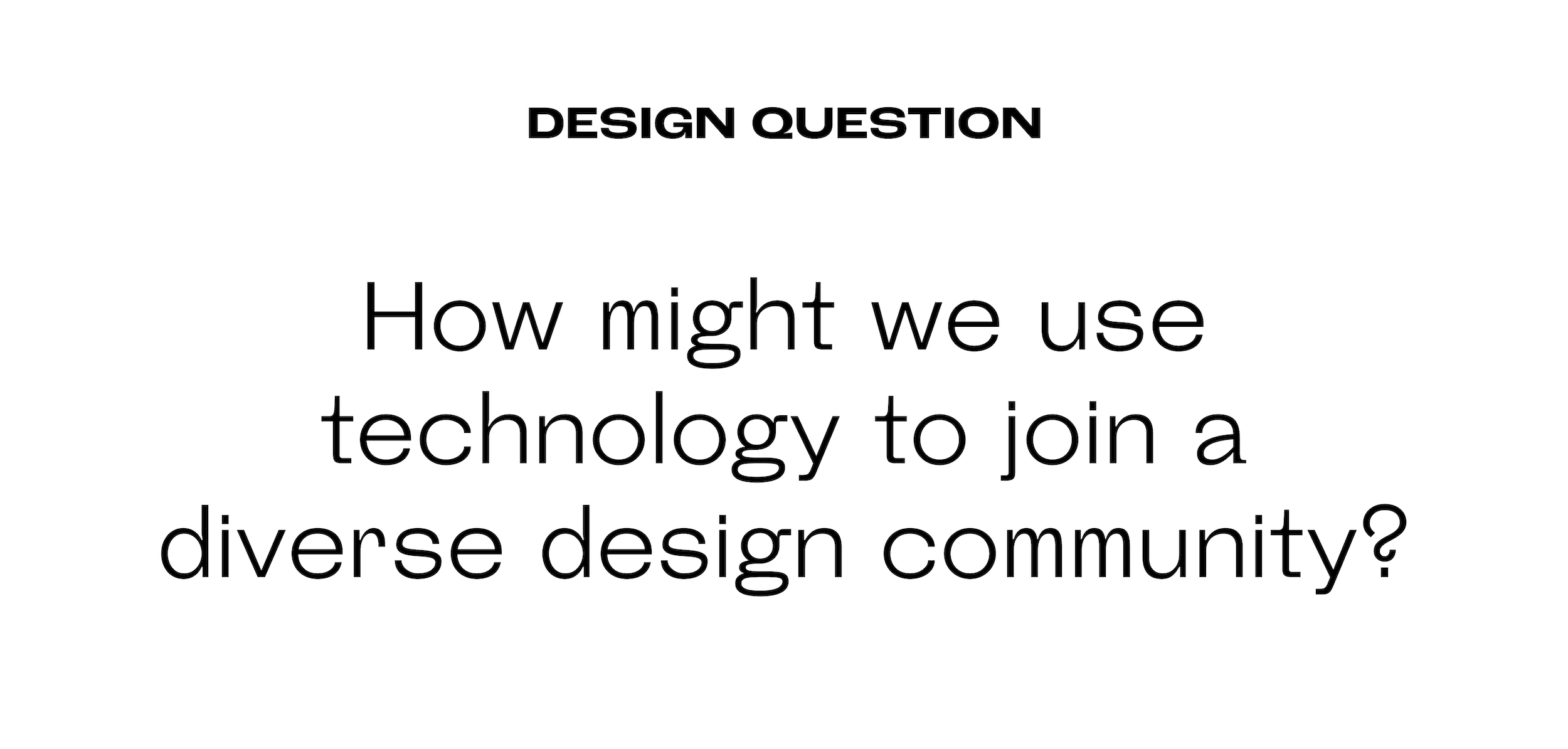
PROBLEM
USC is home to a myriad amount of creatives in different fields. Whether someone is a film student, or practices 3D design or is a business major turned product designer, the developing creative environment is extremely intricate and diverse. However, it's difficult to find cross-collaboration between these groups of people due to the fact that creative communities don't have a centralized platform where they can establish personal and professional relationships with other creatives. Although there are social media platforms dedicated to personal and professional growth, many of these aren't focused on creating an organic method of collaboration and aren't seamlessly integrated into a creative's life.
My team and I set out to tackle this problem in my User Experience class, where we were tasked with creating a product, developing a business model, and fine-tuning a fully-functional interface and design system in Figma.
UNDERSTAND | USER RESEARCH
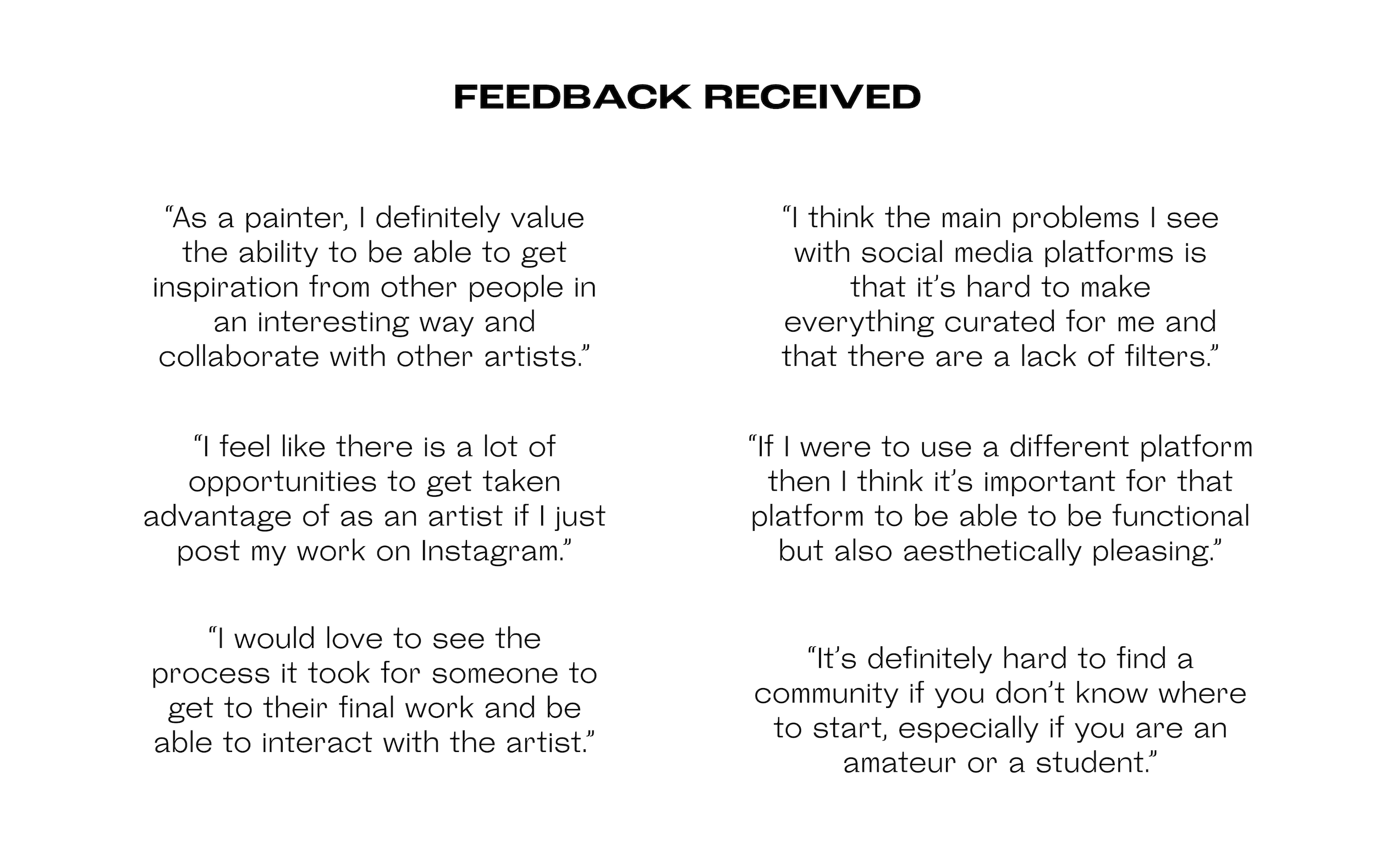
My team and I started exploring this problem by targeting USC's design communities. Since many of us were part of a subset, we went to that respective group and conducted guerilla-style user tests to see which platforms people are currently using to gain feedback on their work, what do they like about those platforms, and what did they value the most in a social media app.
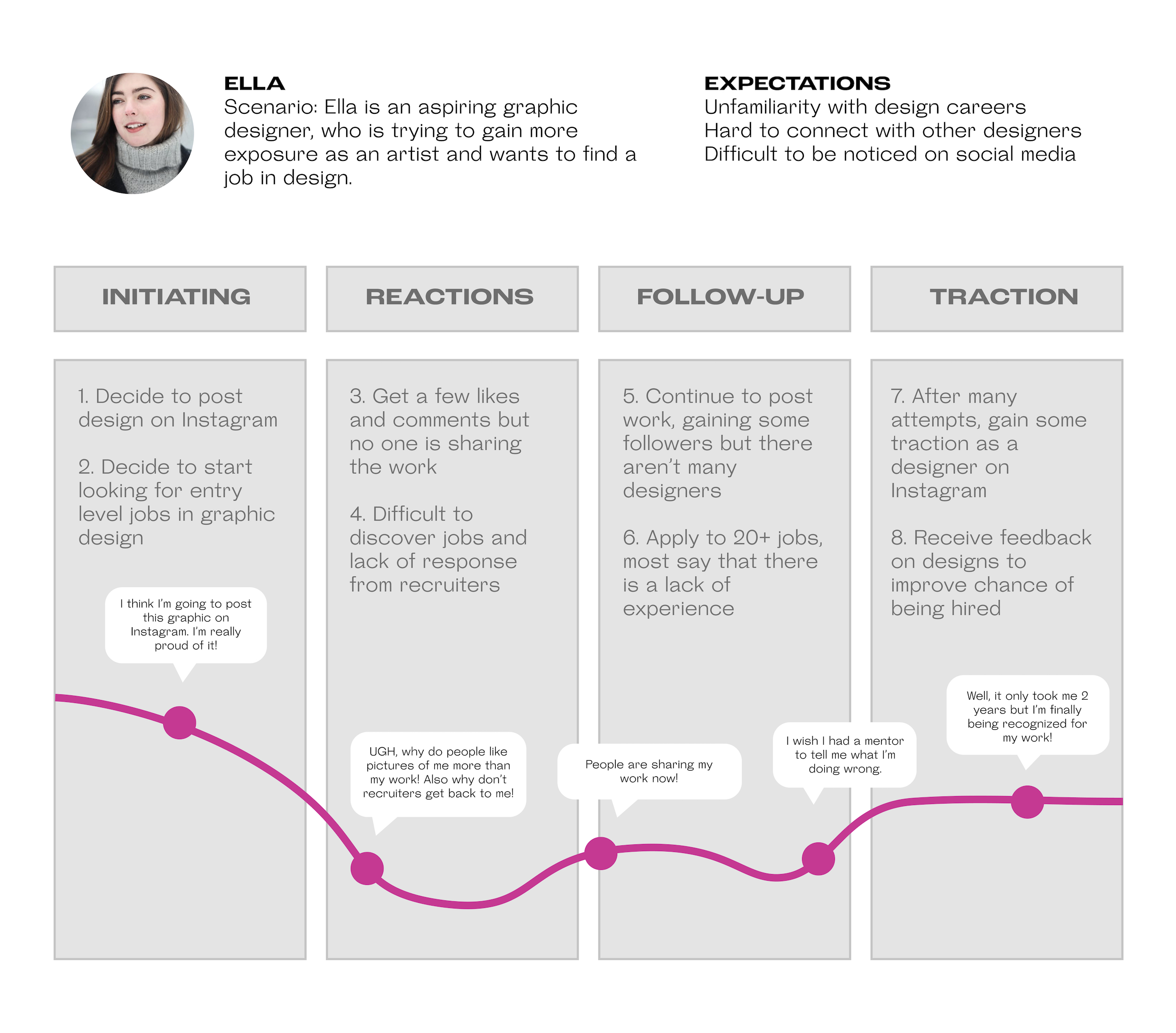
UNDERSTAND | JOURNEY MAP
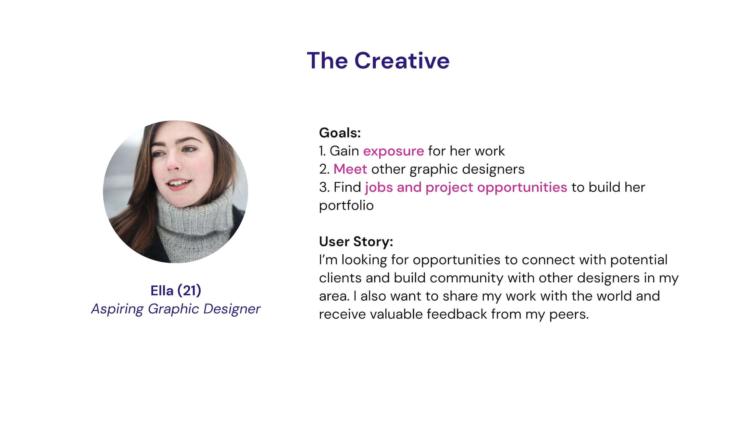
UNDERSTAND | USER PERSONAS
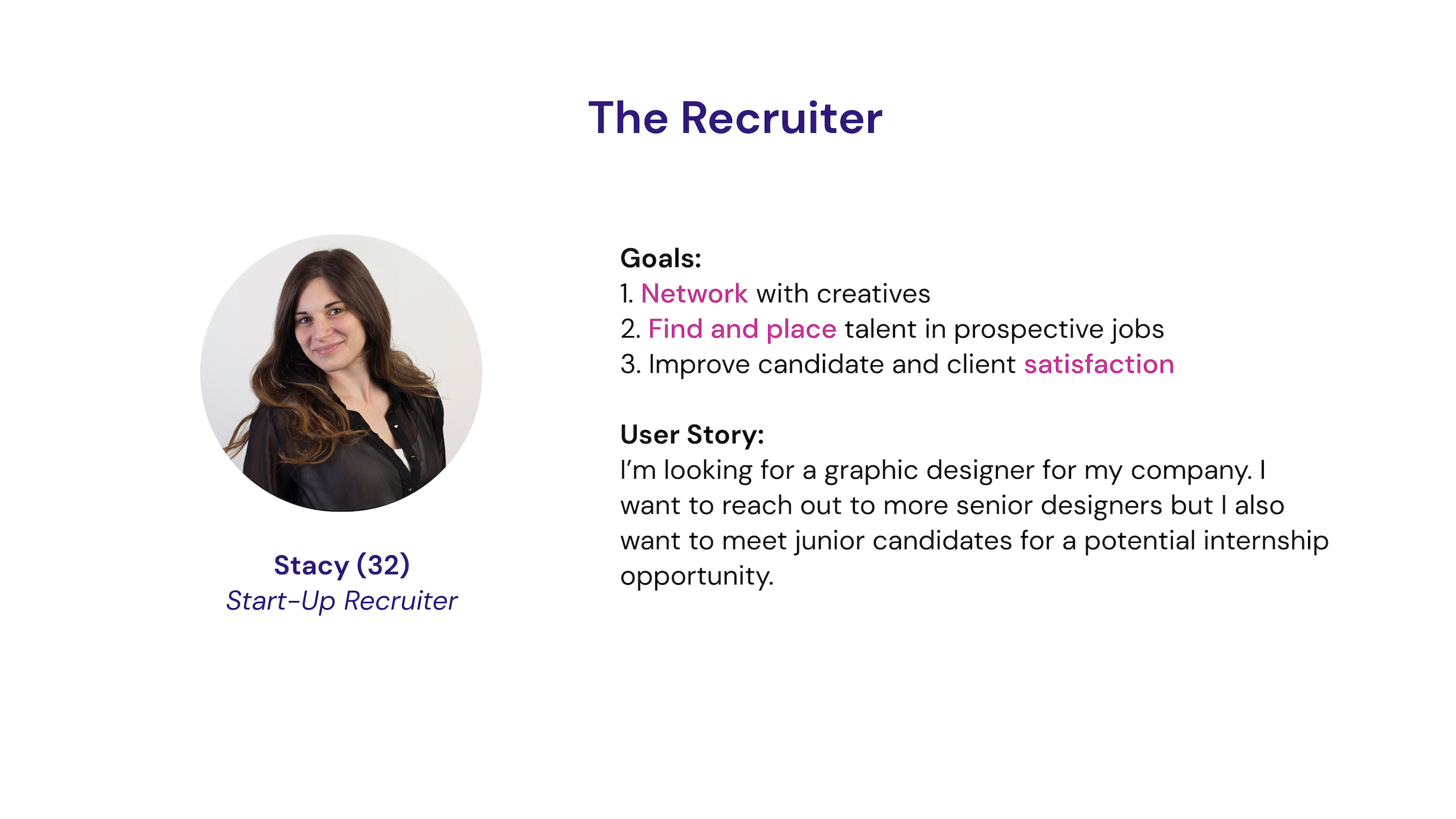
After this research, we broke our users down into two categories: the creative and the recruiter. The "creative" user wants to better themselves as an artist through feedback on their work and wants to find a job or gain mentorship from someone in their field. The "recruiter" user wants to reach out to a dense and diverse group of creatives for jobs or events. Having these users in mind was helpful in guiding design decisions and crafting user personas to explain the features and intentions of Dragonfruit.
UNDERSTAND | VVP
From our tests, we discovered that our users valued collaboration with other artists, inspiration from different types of work, the ability to find programs and events outside of their majors/USC and share their work through other platforms and internships. We decided to craft a visual value proposition to explain the concept of Dragonfruit, focusing on the needs of our users.
The main challenge we were faced with was how do we effectively communicate the value we bring to our users without overwhelming them with a laundry list of features. We decided to approach this by focusing on the core concept of "reaching your fullest artistic potential" and thinking about what that means for certain creatives and how do we align our features to fit this value. We settled on conveying this value through three main features: events, jobs, and groups.
UNDERSTAND | MARKET RESEARCH
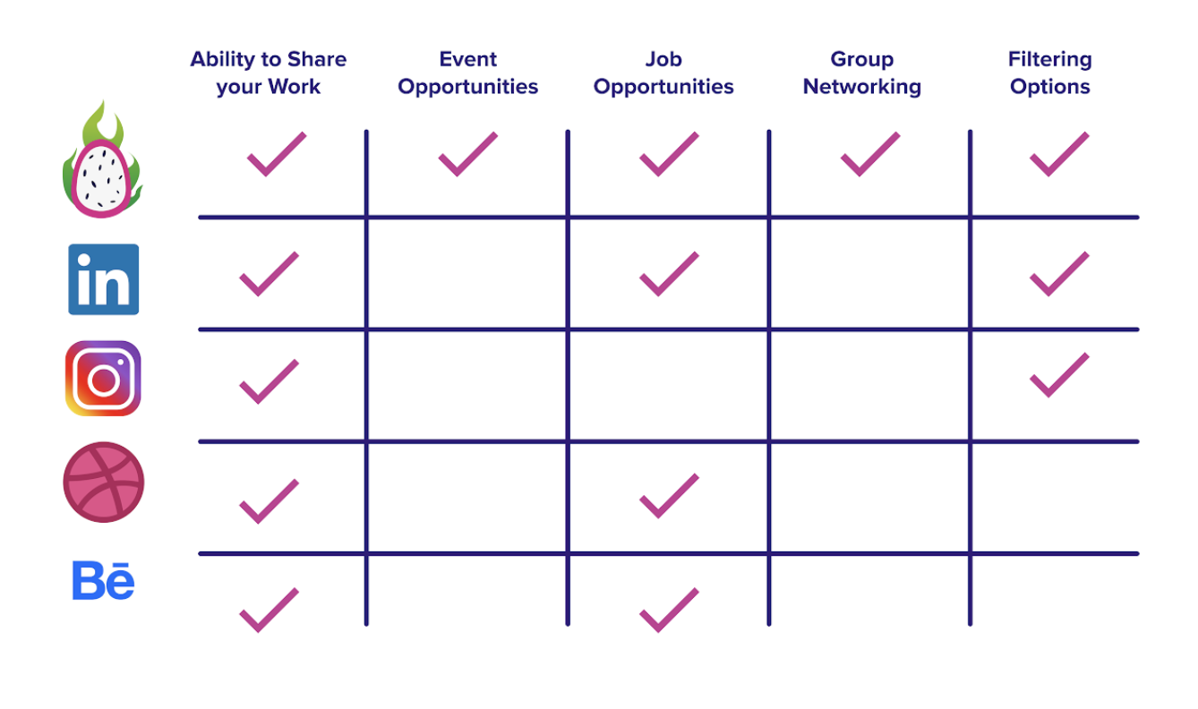
Through our initial user surveys, we came to understand that there are already a number of apps designed to allow people to share their work, like Instagram, LinkedIn, and Behance. However, there wasn't a centralized platform that included event and job discovery, the ability to join groups for mentorship or one that is focused primarily on creative industries. By analyzing our competitors (Instagram, LinkedIn, Dribbble, Behance), we were able to differentiate Dragonfruit through our features and the culture we wanted to establish on the platform.
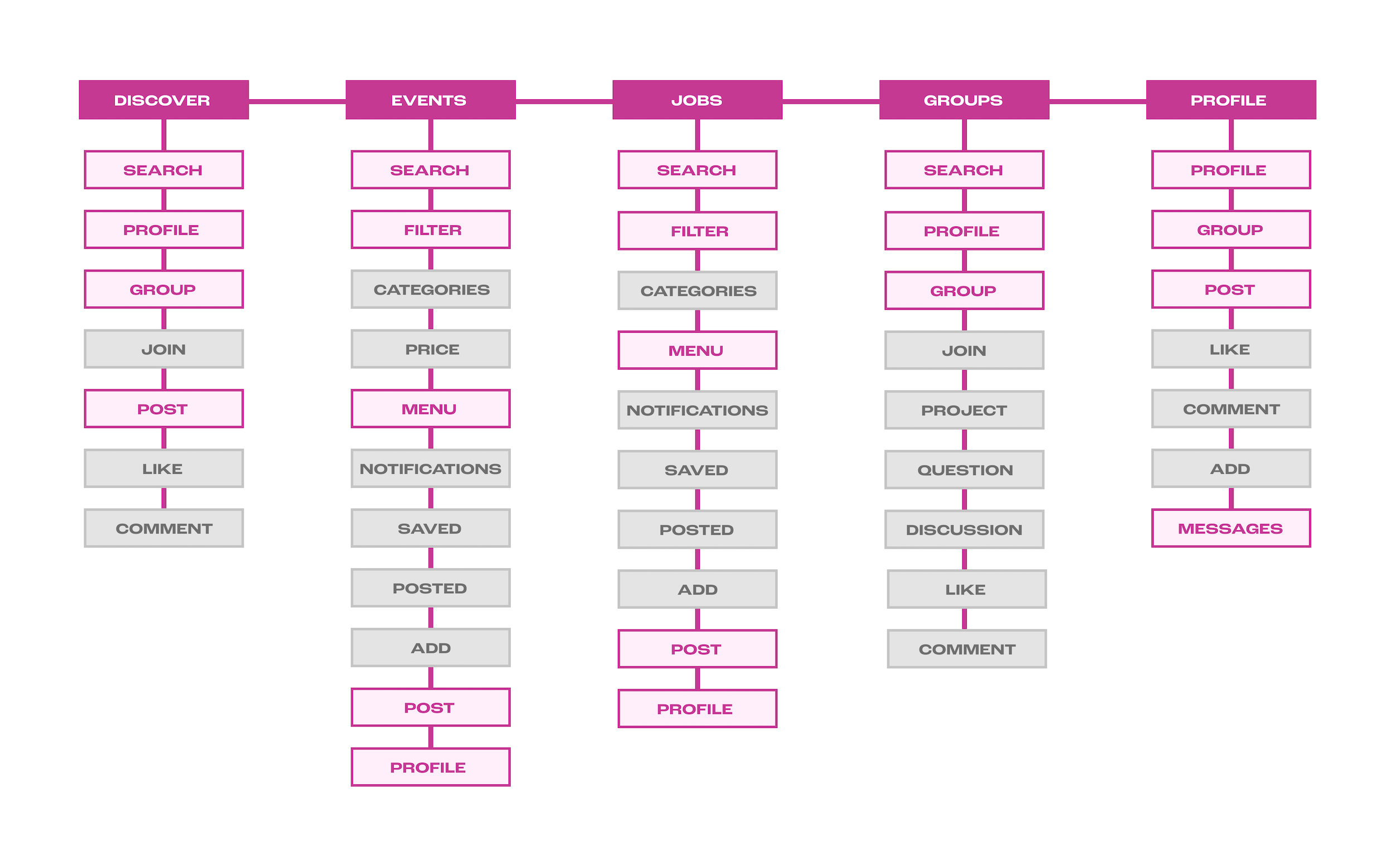
IDEATE | USER FLOW
IDEATE | SKETCHES
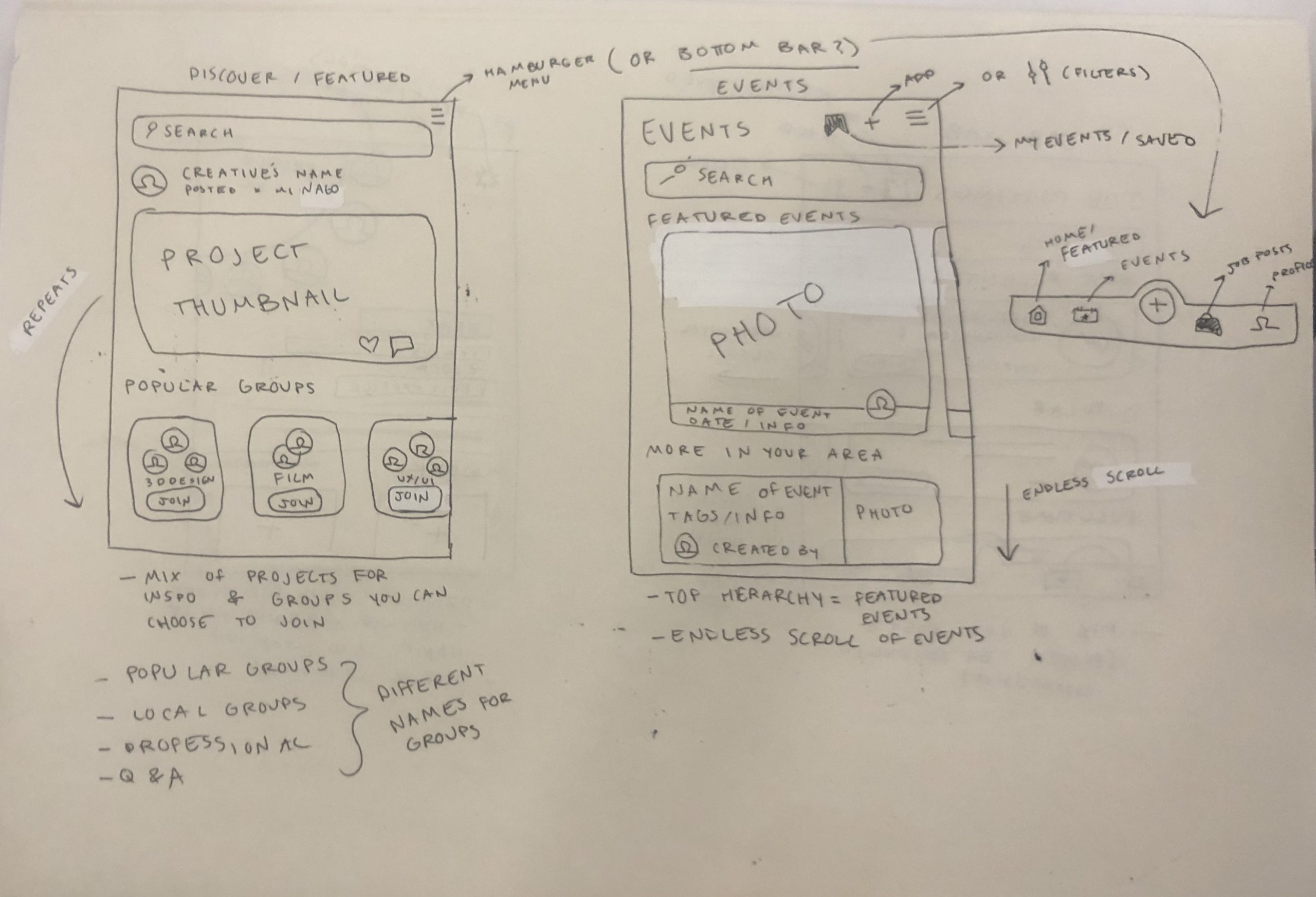
BUILD + TEST | LOW-FIDELITY WIREFRAMES
Prior to testing these wireframes, we originally decided to only focus on discovering posts & groups from other creatives, finding events, applying to jobs and the user profile. However, post user tests of the low-fidelity wireframes, we quickly realized that we needed to add a separate groups tab on the bottom (for easy accessibility) and create a visual hierarchy of the job posts.
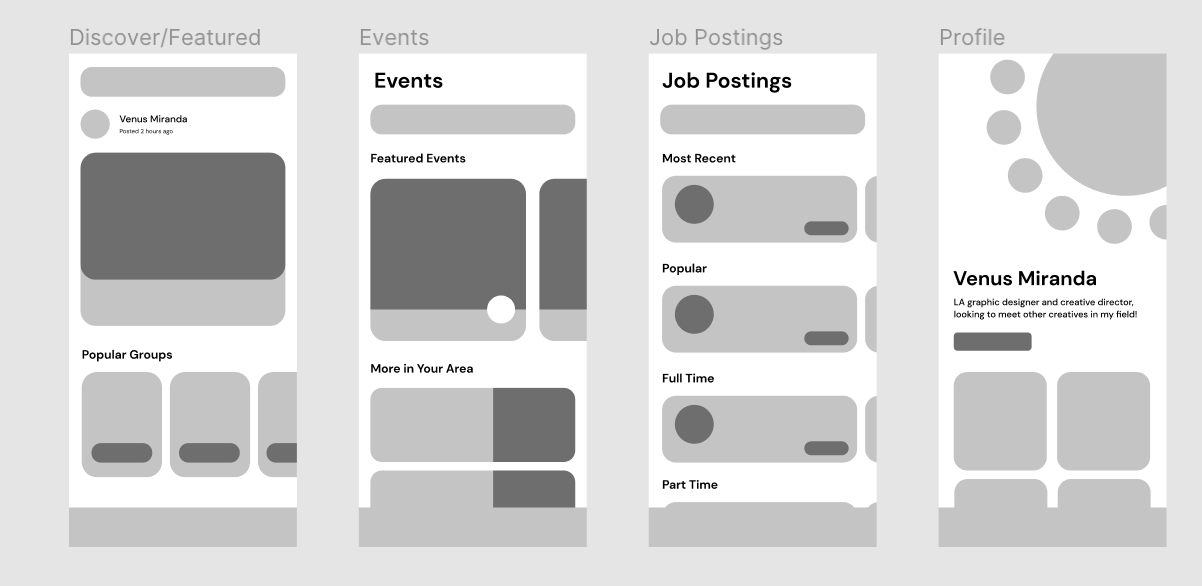
BUILD + TEST | HIGH-FIDELITY WIREFRAMES
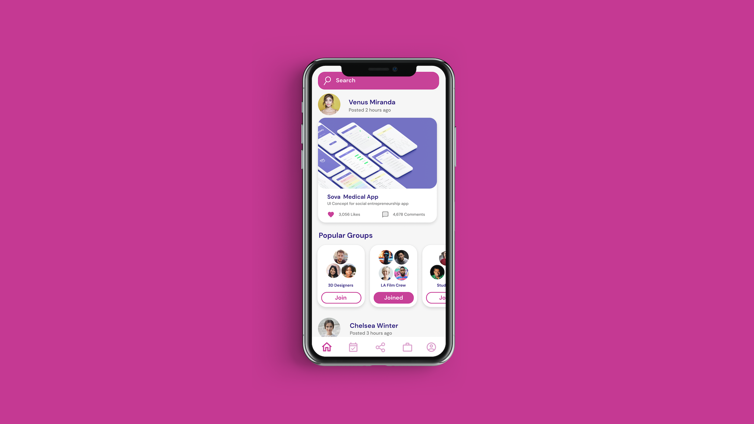
For the Discover page, we decided to vary between showing people's posts and groups to explore. Based on our feedback from the lo-fi wireframes and the initial user tests, our target audience needed the ability to be captivated by a variety of content. So instead of showing just posts or groups, we decided to interchange the two throughout the infinite scroll.
We decided to group the rest of the options that pertain to the Events page by creating a pop-up menu and signaling the menu through three dots. We did this because we wanted this page to look clean and showing all the options on one page can overwhelm the user. We also decided to create a filter option, since a lot of the feedback stated that users wanted the ability to curate what is most important to them - something that current creative community platforms don't allow.
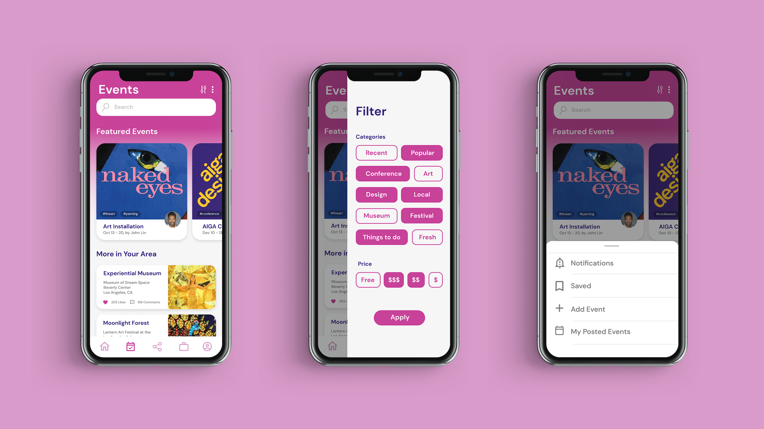
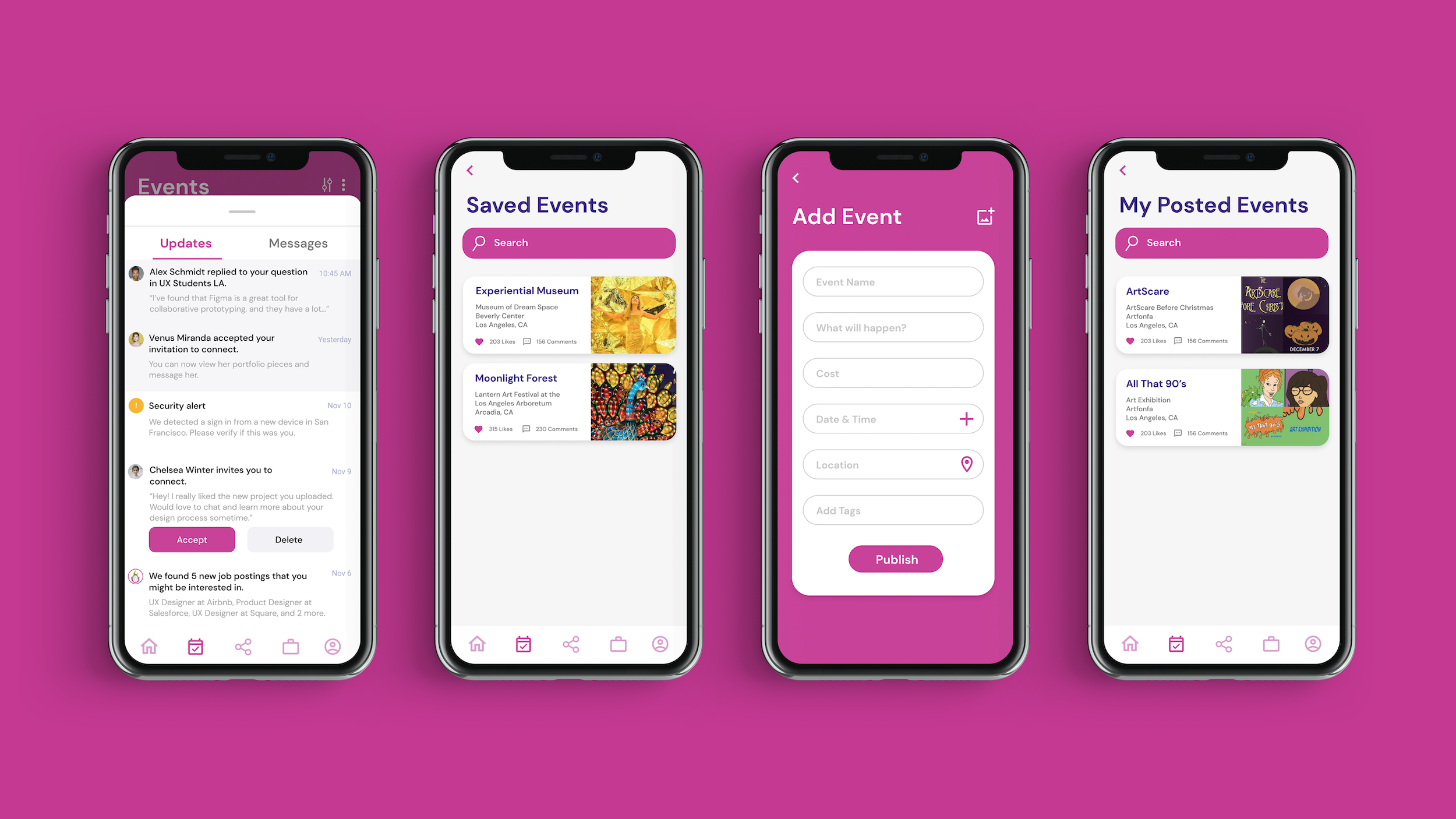
The Events pop-up menu allows the user to access their notifications, save events they're interested in, add events and check the ones that they posted. By giving the user the freedom to manipulate their events in the way that they want to, users can tailor the platform specifically to their preference. We wanted the user to be able to access their data to determine what to do with it (for example, looking at the number of attendees for a specific event). This way, we empower users to not only create occasions but be able to look back at past occurrences and improve on them over time.
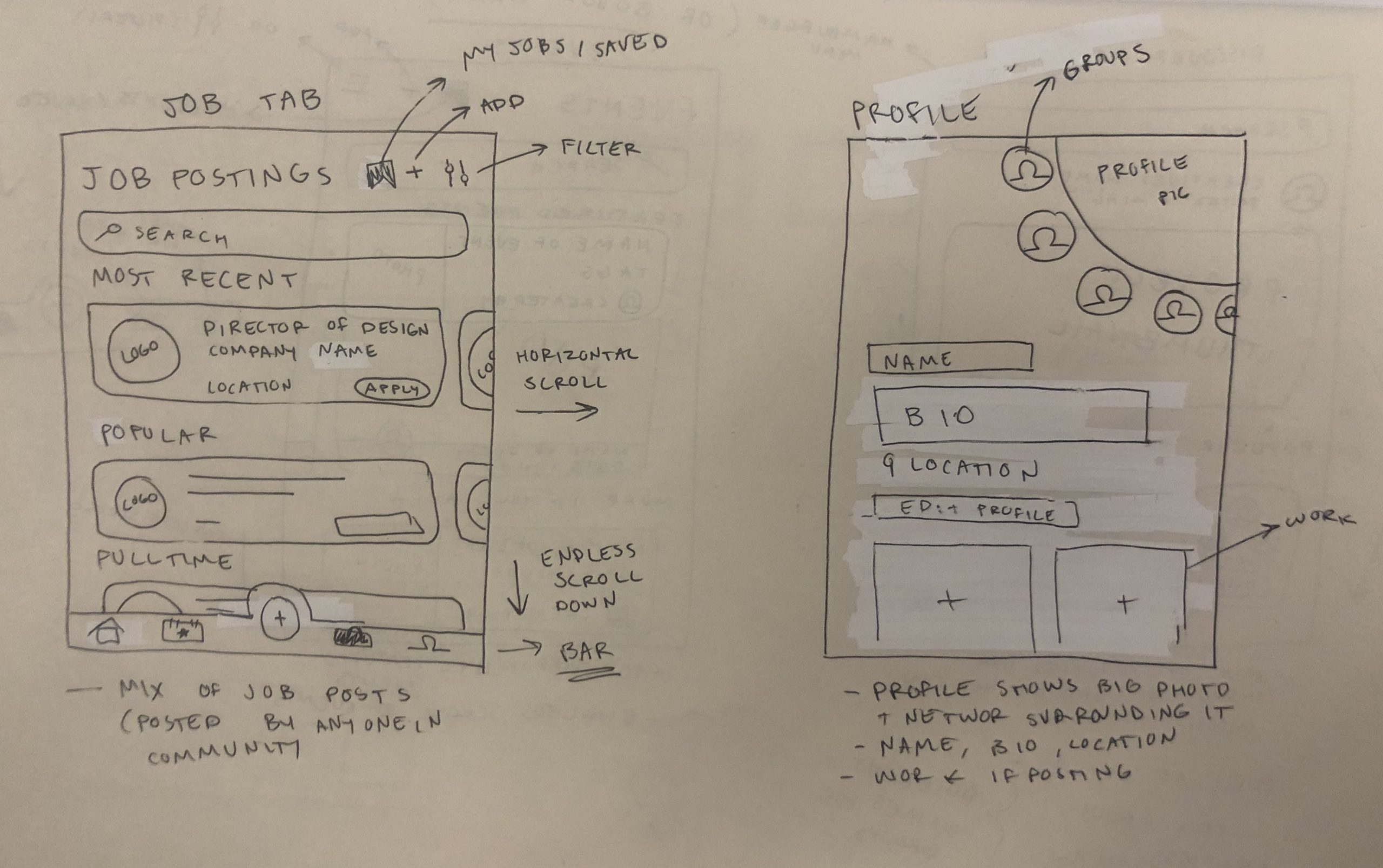
Improving on the original lo-fi wireframes, we decided to create a hierarchy of content displayed on the Jobs page. Instead of having all of the job postings be the same size, we created a larger content card for featured postings. This way, the user is drawn to the top of the page and can find certain postings easier (specifically postings that pertain to them most). We decided to include the hashtags on the jobs (and on the events) so the user can have easy accessibility into a filter that they find interesting. So instead of going to the filter tab, they can just click on the hashtag and it filters the options for them to focus on one hashtag.
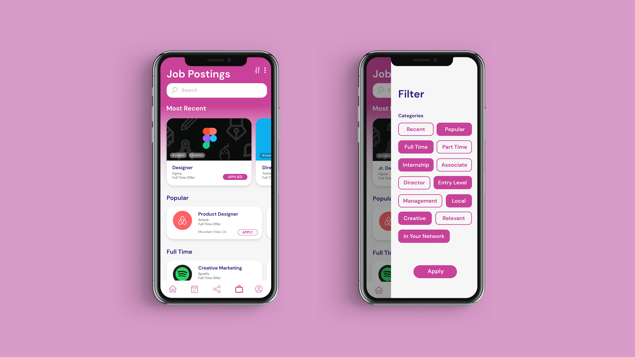
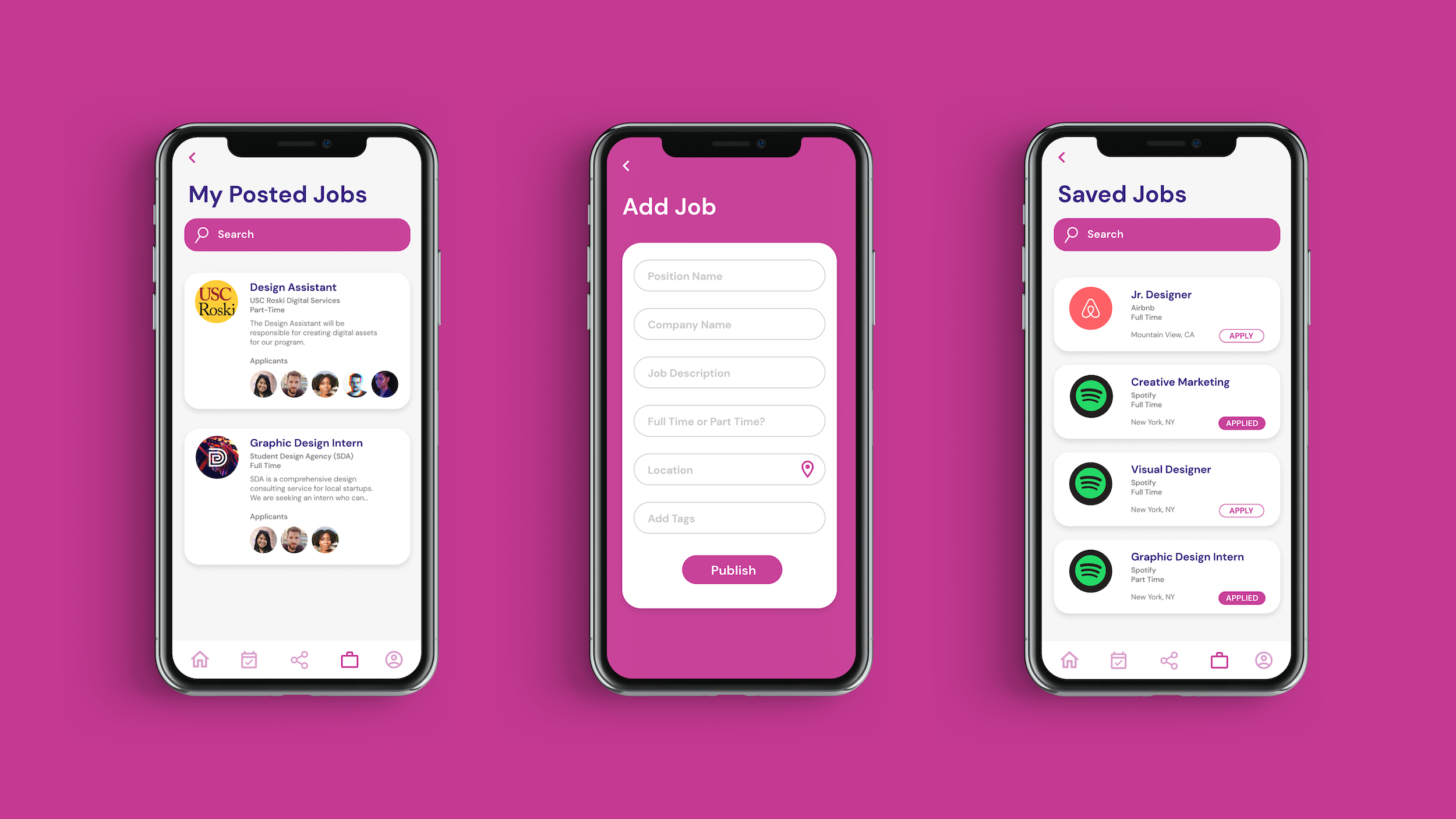
Similarly to the Events page, the Jobs page's drop-down menu includes the ability to check posted jobs, add a job and look through saved jobs. On the Jobs page, we decided to include the list of applicants and their profile because we were thinking about this app from the perspective of a recruiter who is looking for a creative to join their job. By showing the applicants, the recruiter can easily see how many people applied for their job and gauge interest in the position.
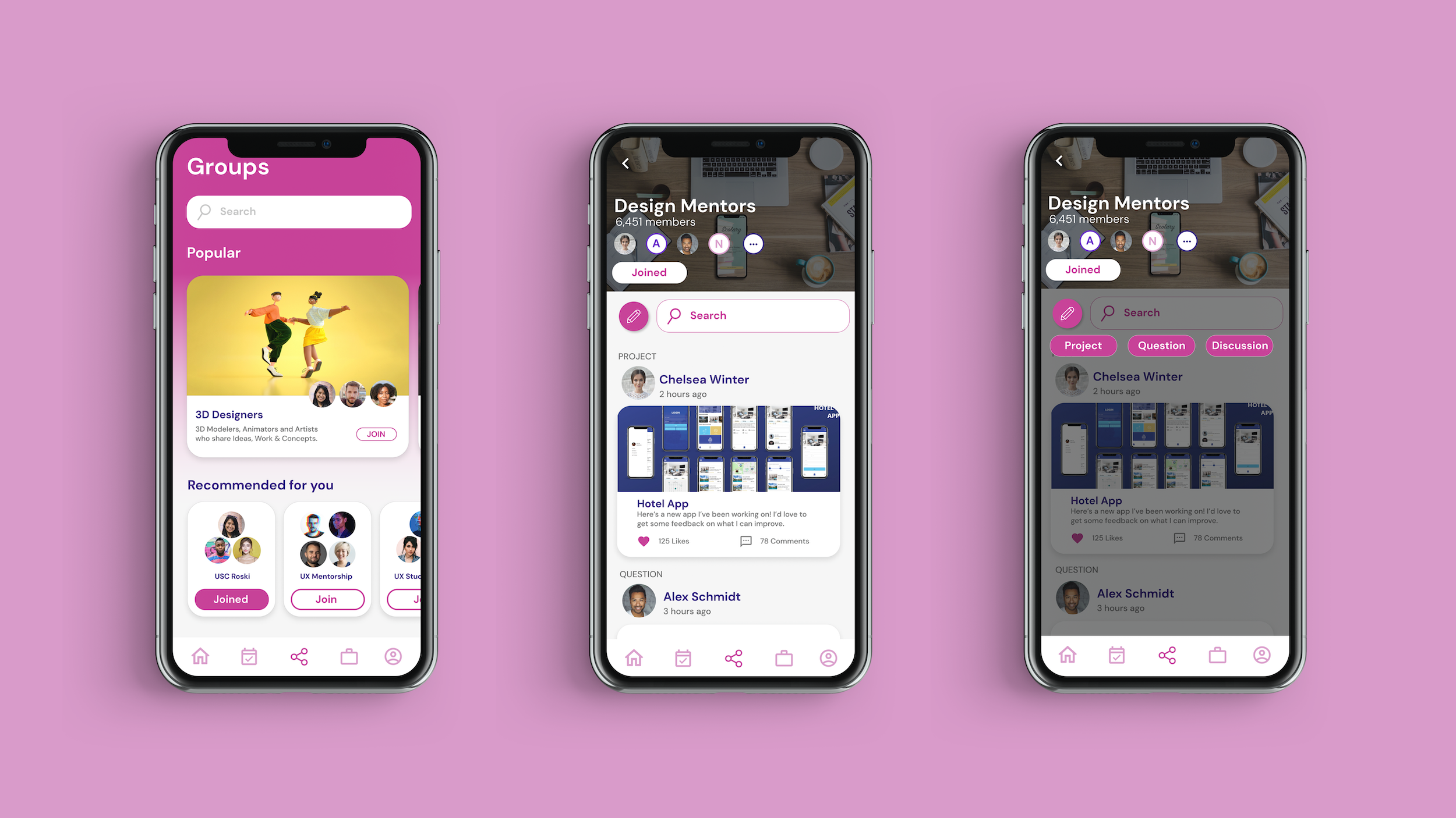
The pinnacle of Dragonfruit is the Group page. On this page, users can find and connect with different creative groups around them. Whether they are seasoned 3D Designers who want to collaborate or students looking for mentorship, this page allows them to do just that. On the Group page, users can post their projects, ask a question or begin a discussion thread about a topic they're interested in. We decided to include this page on the app because, during our initial user interviews, many wanted the ability to collaborate with other creatives who were inside and outside their respective fields. One issue creatives have with popular networking platforms (eg. LinkedIn) is that they feel too formal and unapproachable. To ensure that our app did not give them this problem, all groups can be joined by anyone, and we display a list of member avatars at the top to make them feel more human and welcoming. We believe that allowing our users to do just that establishes multi-person connections, where our users create a web of interactions with each other, instead of connecting with individual people.
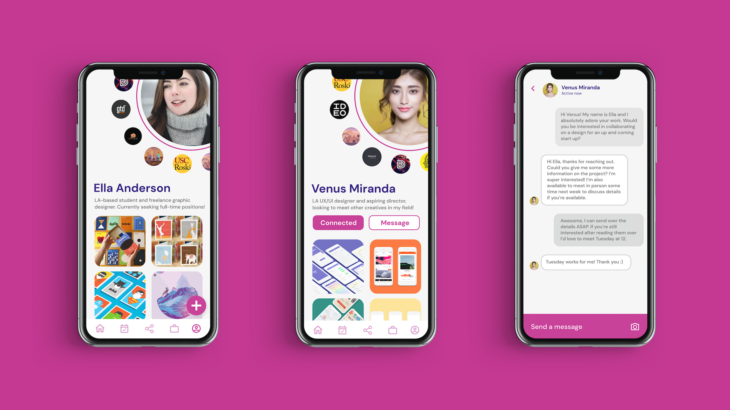
Finally, this is the users' profile. On their profile, users are able to easily acess their groups (located in the spinning circle around their profile picture), post their work, message other users, and check their work for feedback. The reason why we decided to put the users' groups around their profile picture is because we wanted it to be more accessible to them (instead of having them click on the Groups page) and we wanted to display them in a more unique style than what we currently see in our competitors. Also, when clicking on other users, a user can see the groups that those people are in easily on their profile. We chose to display each person's groups with high visibility because finding your creative collective and a sense of community is a crucial aspect of this platform.
One of the main needs/frustrations of an aspiring creative is creating their first portfolio. To address this issue, we wanted our profile page to act as a portfolio, so we created a layout similar to the way creative portfolios often look, with project photos you can click on and view more details about. When users go to upload a new project, we tried to make it as simple as possible so that they only have to upload photos and write a description, without having to worry about visual details like layout.
WHAT I LEARNED
Creating Dragonfruit has taught me to never, ever, EVER assume what the user wants. Originally, since my group and are were all in different creative fields, we presumed a lot of features that we thought other creatives would also want because we wanted them. For example, we originally wanted the app to be primarily focused on giving and receiving feedback because that's something that we thought was lacking in our creative communities. But when we conducted any user interview, we realized that our users wanted the ability to connect with other creatives and establish their collectives, instead of just receiving feedback. This lesson is something that I will now always take with me through out the rest of my career because in product design you are creating for the user, not for yourself.